# load the data
data(hibbs)
# make a scatterplot
plot(
hibbs$growth,
hibbs$vote,
xlab = "Average recent growth in personal income",
ylab = "Incumbent party's vote share")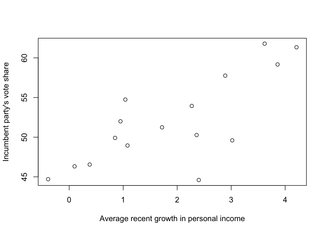
In this blog post, I will work through the textbook Regression and Other Stories by Andrew Gelman, Jennifer Hill, and Aki Vehtari. I’ll be posting excerpts (sometimes verbatim), notes (paraphrased excerpts) and my thoughts about the content (and any other related reading that I come across while understanding the textbook topics).
Starting in Chapter 2, I recreate the plots shown in the textbook first by following their provided code on the supplemental website, and then by recreating it using tidyverse and ggplot. This process gives me practice reading and understanding other people’s code, as well as practice applying tidyverse and ggplot syntax and principles to produce a similar result with different code.
Before I get into the reading, I’ll note that I have not posted my solutions to exercises to honor the request of one of the authors, Aki Vehtari:

However, to learn by writing, I will write about the process of doing the exercises, the results I got, and what I learned from it all.
The data for this textbook is available in the rosdata package.
A couple of errors I had to resolve that I’m documenting here.
If you get the following error when installing a package:
Error in file(filename, "r", encoding = encoding) :
  cannot open the connection
Calls: source -> file
In addition: Warning message:
In file(filename, "r", encoding = encoding) :
  cannot open file 'renv/activate.R': No such file or directory
Execution halted
remove the line source("renv/activate.R") from both the project directory and home directory .Rprofile files.
When running quarto render if you get the following error:
there is no package called …
the issue might be that Quarto is not pointing towards the right .libPaths(). In your home directory’s .Rprofile, add .libPaths("path/to/lib", "path/to/lib", …) and it will show up in quarto check and may resolve this issue.
Part 1: Review key tools and concepts in mathematics, statistics and computing
Chapter 1: Have a sense of the goals and challenges of regression
Chapter 2: Explore data and be aware of issues of measurement and adjustment
Chapter 3: Graph a straight line and know some basic mathematical tools and probability distributions
Chapter 4: Understand statistical estimation and uncertainty assessment, along with the problems of hypothesis testing in applied statistics
Chapter 5: Simulate probability models and uncertainty about inferences and predictions
Part 2: Build linear regression models, use them in real problems, and evaluate their assumptions and fit to data
Chapter 6: Distinguish between descriptive and causal interpretations of regression, understanding these in historical context
Chapter 7: Understand and work with simple linear regression with one predictor
Chapter 8: Gain a conceptual understanding of least squares fitting and be able to perform these fits on the computer
Chapter 9: Perform and understand probabilistic and simple Bayesian information aggregation, and be introduced to prior distributions and Bayesian inference
Chapter 10: Build, fit, and understand linear models with multiple predictors
Chapter 11: Understand the relative importance of different assumptions of regression models and be able to check models and evaluate their fit to data
Chapter 12: Apply linear regression more effectively by transforming and combining predictors
Part 3: Build and work with logistic regression and generalized linear models
Chapter 13: Fit, understand, and display logistic regression models for binary data
Chapter 14: Build, understand and evaluate logistic regressions with interactions and other complexities
Chapter 15: Fit, understand, and display generalized linear models, including the Poisson and negative binomial regression, ordered logistic regression, and other models
Part 4: Design studies and use data more effectively in applied settings
Chapter 16: Use probability theory and simulation to guide data-collection decisions, without falling into the trap of demanding unrealistic levels of certainty
Chapter 17: Use poststratification to generalize from sample to population, and use regression models to impute missing data
Part 5: Implement and understand basic statistical designs and analyses for causal inference
Chapter 18: Understand assumptions underlying causal inference with a focus on randomized experiments
Chapter 19: Perform causal inference in simple setting using regressions to estimate treatments and interactions
Chapter 20: Understand the challenges of causal inference from observational data and statistical tools for adjusting for differences between treatment and control groups
Chapter 21: Understand the assumptions underlying more advanced methods that use auxiliary variables or particular data structures to identify causal effects, and be able to fit these models to data
Part 6: Become aware of more advanced regression models
Appendixes
Appendix A: Get started in the statistical software R, with a focus on data manipulation, statistical graphics, and fitting using regressions
Appendix B: Become aware of some important ideas in regression workflow
After working through the book, you should be able to fit, graph, understand, and evaluate linear and generalized linear models and use these model fits to make predictions and inferences about quantities of interest, including causal effects of treatments and exposures.
Alternate title: Prediction as a unifying theme in statistics and causal inference
Prediction: for new people or new items that are not in the sample, future outcomes under differently potentially assigned treatments, and underlying constructs of interest, if they could be measured exactly.
Key skills you should learn from this book:
Understanding regression models: mathematical models for predicting an outcome variable from a set of predictors, starting with straight-line fits and moving to various nonlinear generalizations
Constructing regression models: with many options involving the choice of what variables to include and how to transform and constrain them
Fitting regression models to data
Displaying and interpreting the results
Inference: using mathematical models to make general claims from particular data.
Regression: a method that allows researchers to summarize how predictions or average values of an outcome vary across individuals defined by a set of predictors.
# load the data
data(hibbs)

# make a scatterplot
plot(
  hibbs$growth,
  hibbs$vote,
  xlab = "Average recent growth in personal income",
  ylab = "Incumbent party's vote share")
# estimate the regression: y = a + bx + error
M1 <- stan_glm(vote ~ growth, data=hibbs)
# make a scatter plot
plot(
hibbs$growth,
hibbs$vote,
xlab = "Average recent growth in personal income",
ylab = "Incumbent party's vote share")
# add fitted line to the graph
abline(coef(M1), col = 'gray')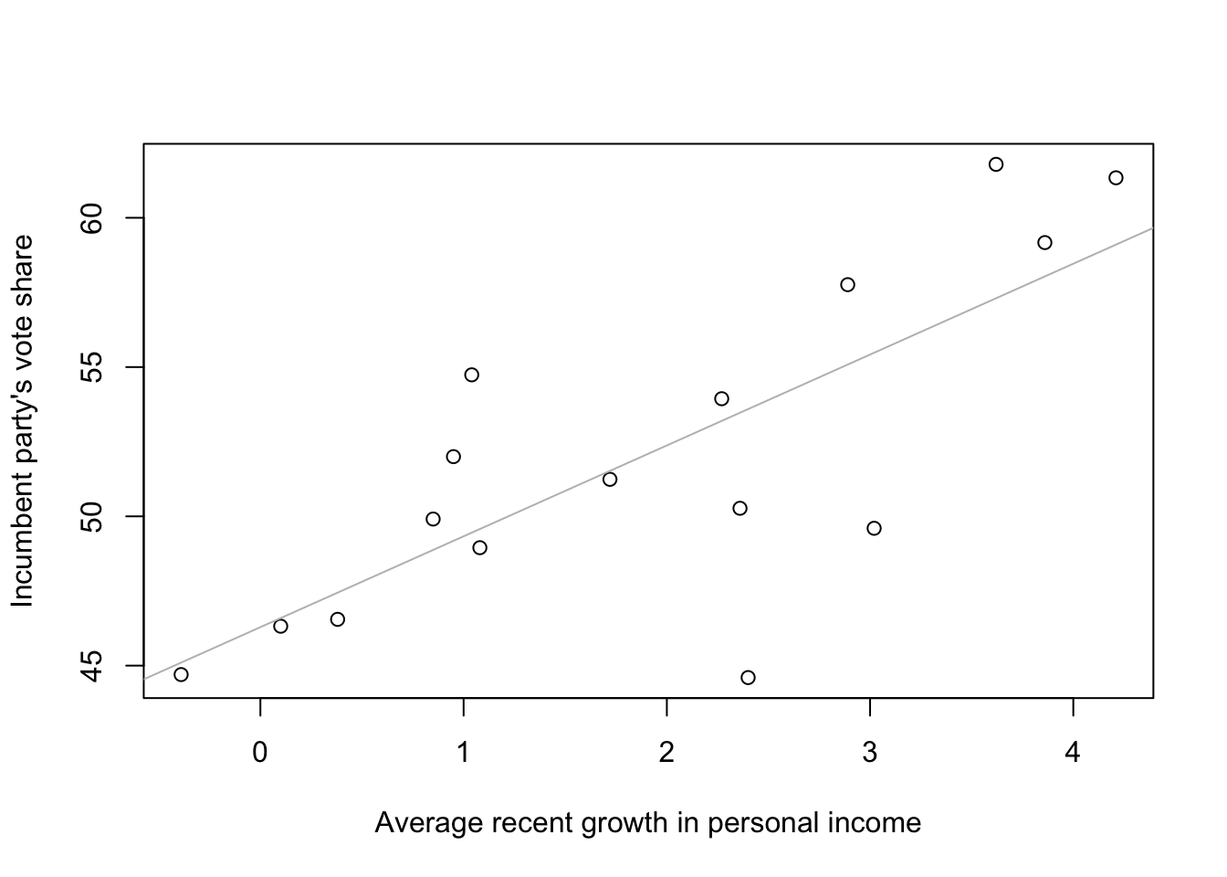
# display the fitted model
print(M1)
stan_glm
family: gaussian [identity]
formula: vote ~ growth
observations: 16
predictors: 2
------
Median MAD_SD
(Intercept) 46.3 1.7
growth 3.0 0.7
Auxiliary parameter(s):
Median MAD_SD
sigma 3.9 0.7
------
* For help interpreting the printed output see ?print.stanreg
* For info on the priors used see ?prior_summary.stanregy = 46.3 + 3.0x
MAD: Median Absolute Deviations.
sigma: the scale of the variation in the data explained by the regression model (the scatter of points above and below the regression line). The linear model predicts vote share roughly to an accuracy of 3.9 percentage points.
Some of the most important uses of regression:
Prediction: Modeling existing observations or forecasting new data.
Exploring associations: Summarizing how well one variable, or set of variables, predicts the outcome. One can use a model to explore associations, stratifications, or structural relationships between variables.
Extrapolation: Adjusting for known differences between the sample (observed data) and a population of interest.
Causal inference: Estimating treatment effects. A key challenge of causal inference is ensuring that treatment and control groups are similar, on average, before exposure to treatment, or else adjusting for differences between these groups.
Selection bias: perhaps peacekeepers chose the easy cases, which would explain the difference in outcomes. The treatment–peacekeeping–was not randomly assigned. They had an observational study rather than an experiment, where we must do our best to adjust for pre-treatment differences between the treatment and control groups.
Censoring: certain ranges of data cannot be observed (e.g. countries where civil war had not yet returned by the time data collection ended)
When adjusting for badness, peacekeeping was performed in tougher conditions, on average. As a result, the adjustment increases the estimated beneficial effects of peacekeeping, at least during the study.
In this sort of regression with 50 data points and 30 predictors and no prior information to guide the inference, the coefficient estimates will be hopelessly noisy and compromised by dependence among predictors.
The treatments are observational and not externally applied. There is no reason to believe that the big differences in gun-related deaths between states are mostly attributable to particular policies.
In both cases, policy conclusions have been drawn from observational data, using regression modeling to adjust for differences between treatment and control groups.
It is more practical to perform adjustments when there is a single goal (peacekeeping study)
particular concern that the UN might be more likely to step in when the situation on the ground was not so bad
the data analysis found the opposite
the measure of badness is constructed based on particular measured variables and so it is possible that there are important unmeasured characteristics that would cause adjustments to go the other way
The gun-control model adjusts for many potential causal variables at once
The effect of each law is estimated conditional on all others being held constant (not realistic—no particular reason for their effects to add up in a simple manner)
The comparison is between states, which vary in systematic ways (it is not at all clear that a simple model can hope to adjust for the relevant differences)
Regression analysis was taken naively to be able to control for variation and give valid causal inference from observational data
Two different ways in which regression is used for causal inference: estimating a relationship and adjusting for background variables.
Randomization: a design in which people—or, more generally, experimental units—are randomly assigned to treatment or control groups.
There are various ways to attain approximate comparability of treatment and control groups, and to adjust for known or modeled differences between the groups.
We assume the comparability of the groups assigned to different treatments so that a regression analysis predicting the outcome given the treatment gives us a direct estimate of the causal effect.
It is always possible to estimate a linear model, even if it does not fit the data.
Interactions: treatment effects that vary as a function of other predictors in a model.
In most real-world causal inference problems, there are systematic differences between experimental units that receive treatment and control. In such settings it is important to adjust for pre-treatment differences between the groups, and we can use regression to do this.
Adjusting for background variables is particularly important when there is imbalance so that the treated and control groups differ on key pre-treatment predictors.
The estimated treatment effect is necessarily model based.
A model fit to survey data: earnings = 11000 + 1500 * (height - 60) + error, with errors in the range of mean of 0 and standard deviation of 22000.
Prediction: useless for forecasting because errors are too large
Exploring an association: best fit for this example, as the estimated slope is positive, can lead to further research to study reasons taller people earn more than shorter people
Sampling inference: the regression coefficients can be interpreted directly to the extent that people in the survey are a representative sample of the population of interest
Causal inference: height is not a randomly assigned treatment. Tall and short people may differ in many other ways.
Statistical analysis cycles through four steps:
Accept that we can learn from statistical analysis—we can generalize from sample to population, from treatment to control, and from observed measurements to underlying constructs of interest—even while these inferences can be flawed.
Overinterpretation of noisy data: the gun control study took existing variations among states and too eagerly attributed it to available factors.
No study is perfect.
We should recognize challenges in extrapolation and then work to adjust for them.
Three concerns related to fitting models to data and using models to make predictions:
The starting point for any regression problem is data on an outcome variable y and one or more predictors x.
Information should be available on what data were observed at all
We typically have prior knowledge coming from sources other than the data at hand. Where local data are weak it would be foolish to draw conclusions without using prior knowledge
Three sorts of assumptions that are essential to any regression model of an outcome y given predictors x.
The functional form of the relation between x and y
Where the data comes from (strongest assumptions tend to be simple and easy to understand, weaker assumptions, being more general, can also be more complicated)
Real-world relevance of the measured data
The traditional approach to statistical analysis is based on summarizing the information in the data, not using prior information, but getting estimates and predictions that have well-understood statistical properties, low bias and low variance.
Unbiasedness: estimates should be true on average
Coverage: confidence intervals should cover the true parameter value 95% of the time
Conservatism: sometimes data are weak and we can’t make strong statements, but we’d like to be able to say, at least approximately, that our estimates are unbiased and our intervals have the advertised coverage.
In classical statistics there should be a clear and unambiguous (“objective”) path from data to inferences, which in turn should be checkable, at least in theory, based on their frequency properties.
Incorporates prior information into inferences, going beyond the goal of merely summarizing existing data. The analysis gives more reasonable results and can be used to make direct predictions about future outcomes and about the results of future experiments.
The prior distribution represents the arena over which any predictions will be evaluated.
We have a choice: classical inference, leading to pure summaries of data which can have limited value as predictions; or Bayesian inference, which in theory can yield valid predictions even with weak data, but relies on additional assumptions.
All Bayesian inferences are probabilistic and thus can be represented by random simulations. For this reason, whenever we want to summarize uncertainty in estimation beyond simple confidence intervals, and whenever we want to use regression models for predictions, we go Bayesian.
In general, we recommend using Bayesian inference for regression
If prior information is available, you can use it
if not, Bayesian regression with weakly informative default priors still has the advantage of yielding stable estimates and producing simulations that enable you to express inferential and predictive uncertainty (estimates with uncertainties and probabilistic predictions or forecasts)
Bayesian regression in R:
fit <- stan_glm(y ~ x, data=mydata)

# stan_glm can run slow for large datasets, make it faster by running in optimizing mode
fit <- stan_glm(y ~ x, data=mydata, algorithm="optimizing")
least squares regression (classical statistics)
fit <- lm(y ~ x, data=mydata)Bayesian and simulation approaches become more important when fitting regularized regression and multilevel models.
It took me 8-9 days to complete the 10 exercises at the end of this chapter. A few observations:
Experiment design, even with simple paper helicopters, still requires time, effort and attention to detail. Even then, a well thought out and executed plan can still end up with uninspiring results. It is therefore the process of experimentation and not the result where I learned the most. It was important to continue experimentation (as it resulted in finding a high-performing copter) even after my initial approach didn’t seem to work as I had thought it would.
Finding good and bad examples of research is hard on your own! I relied on others existing work where they explicitly called out (and explained) good and bad research, sometimes with great detail, in order to answer exercises 1.7 and 1.8.
Think about the problem in real life! I don’t know if my answer to 1.9 is correct, but it helped to think about the physical phenomenon that was taking place (a helicopter falling through air, pulled by gravity) in order to come up with a better model fit than the example provided. I found that thinking of physical constraints of the real world problem helped narrow the theoretical model form.
Pick something you’re interested in and is worth your while! For exercise 1.10, the dataset I have chosen is the NFL Play-by-Play dataset, as I’m already working on a separate project where I’ll be practicing writing SQL queries to analyze the data. Play-by-play data going back to 1999 will provide me with ample opportunities to pursue different modeling choices. My interest in football will keep me dedicated through the tough times.
In this book we will be:
fitting lines and curves to data.
making comparisons and predictions and assessing our uncertainties in the resulting inferences.
discuss the assumptions underlying regression models, methods for checking these assumptions, and directions for improving fitted models.
discussing the challenges of extrapolating from available data to make causal inferences and predictions for new data.
using computer simulations to summarize the uncertainties in our estimates and predictions.
I’ll recreate the charts shown in the textbook by following the code provided in the website supplement to the book, using tidyverse where it makes sense:
# load the Human Development Index data
# start using DT to produce better table outputs
library(DT)
hdi <- read.table("../../../ROS_data/HDI/data/hdi.dat", header=TRUE)
DT::datatable(head(hdi))
# load income data via the votes data
library(foreign)
votes <- read.dta("../../../ROS_data/HDI/data/state vote and income, 68-00.dta")
DT::datatable(head(votes), options=list(scrollX=TRUE))# preprocess
income2000 <- votes[votes[,"st_year"]==2000, "st_income"]
# it seems like the income dataset doesn't have DC
# whereas HDI does
# so we're placing an NA for DC in the income list
state.income <- c(income2000[1:8], NA, income2000[9:50])
state.abb.long <- c(state.abb[1:8], "DC", state.abb[9:50])
state.name.long <- c(state.name[1:8], "Washington, D.C.", state.name[9:50])
hdi.ordered <- rep(NA, 51)
can <- rep(NA, 51)
for (i in 1:51) {
ok <- hdi[,"state"]==state.name.long[i]
hdi.ordered[i] <- hdi[ok, "hdi"]
can[i] <- hdi[ok, "canada.dist"]
}
no.dc <- state.abb.long != "DC"# plot average state income and Human Development Index
par(mar=c(3, 3, 2.5, 1), mgp=c(1.5, .2, 0), tck=-0.01, pty='s')
plot(
state.income,
hdi.ordered,
xlab="Average state income in 2020",
ylab="Human Development Index",
type="n")
text(state.income, hdi.ordered, state.abb.long)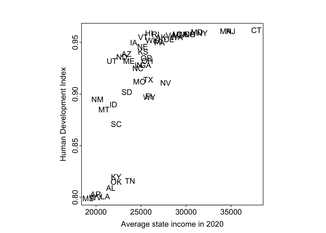
The pattern between HDI numbers and average state income is strong and nonlinear. If anyone is interested in following up on this, we suggest looking into South Carolina and Kentucky, which are so close in average income and so far apart on HDI.
# plot rank of average state income and Human Development Index
par(mar=c(3, 3, 2.5, 1), mgp=c(1.5, 0.2, 0), tck=-0.01, pty='s')
plot(
  rank(state.income[no.dc]),
  rank(hdi.ordered[no.dc]),
  xlab="Rank of average state income in 2000",
  ylab="Rank of Human Development Index",
  type="n")

text(rank(state.income[no.dc]), rank(hdi.ordered[no.dc]), state.abb)
There is a high correlation between the ranking of HDI and state income.
I will redo the above data processing and plotting with tidyverse and ggplot for practice:
# plot average state income and Human Development Index
# using tidyverse and ggplot
merged_data <- hdi %>% dplyr::left_join(
  votes %>% filter(st_year==2000),
  by = c("state" = "st_state")
)

p <- ggplot(
  merged_data,
  aes(x = st_income, y = hdi, label =  st_stateabb)
) + theme(
    plot.margin = margin(3, 3, 2.5, 1, "lines"),
    panel.border = element_rect(colour = "black", fill=NA, size=1),
    panel.background = element_rect(fill = 'white'),
    aspect.ratio = 1
  ) +
  labs(
    x = "Average state income in 2020",
    y = "Human Development Index"
  )
Warning: The `size` argument of `element_rect()` is deprecated as of ggplot2 3.4.0.
ℹ Please use the `linewidth` argument instead.p + geom_text()Warning: Removed 1 rows containing missing values (`geom_text()`).
None of the tidyverse methods I found (row_number, min_rank, dense_rank, percent_rank, cume_dist, or ntile) work quite like rank (where “ties” are averaged), so I continued using rank for this plot:
# plot rank of average state income and Human Development Index
p <- ggplot(
  merged_data %>% filter(state != 'Washington, D.C.'),
  aes(x = rank(st_income), y = rank(hdi), label = st_stateabb),
  ) + theme(
    plot.margin = margin(3, 3, 2.5, 1, "lines"),
    panel.border = element_rect(colour = "black", fill=NA, size=1),
    panel.background = element_rect(fill = 'white'),
    aspect.ratio = 1
  ) +
  labs(
    x = "Rank of average state income in 2000",
    y = "Rank of Human Development Index"
  )

p + geom_text()
The relevance of this example is that we were better able to understand the data by plotting them in different ways.
In the code chunks below, I will recreate the plots in Figure 2.3 in the text (distribution of political ideology by income and distribution of party identification by income)., using their code provided on the supplemental website.
pew_data_path <- file.path(data_root_path, "Pew/data/pew_research_center_june_elect_wknd_data.dta")
pew_pre <- read.dta(pew_data_path)
n <- nrow(pew_pre)
DT::datatable(head(pew_pre), options=list(scrollX=TRUE))
# weight
pop.weight0 <- pew_pre$weight
head(unique(pop.weight0))[1] 1.326923 0.822000 0.493000 0.492000 2.000000 1.800000# income (1-9 scale)
inc <- as.numeric(pew_pre$income)
# remove "dk/refused" income level
inc[inc==10] <- NA
levels(pew_pre$income) [1] "less than $10,000" "$10,000-$19,999" "$20,000-$29,999"
[4] "$30,000-$39,999" "$40,000-$49,000" "$50,000-$74,999"
[7] "$75,000-$99,999" "$100,000-$149,999" "$150,000+"
[10] "dk/refused" unique(inc) [1] 6 8 NA 4 7 5 9 1 3 2# I believe these are the midpoints of the income levels
value.inc <- c(5,15,25,35,45,62.5,87.5,125,200)
# maximum income value
n.inc <- max(inc, na.rm = TRUE)
n.inc[1] 9# party id
pid0 <- as.numeric(pew_pre[,"party"])
lean0 <- as.numeric(pew_pre[,"partyln"])
levels(pew_pre[,"party"])[1] "missing/not asked" "republican" "democrat"
[4] "independent" "no preference" "other"
[7] "dk" levels(pew_pre[,"partyln"])[1] "missing/not asked" "lean republican" "lean democrat"
[4] "other/dk" unique(pid0)[1] 3 2 4 7 5 6 NAunique(lean0)[1] NA 3 4 2# assigning new integers for party id
pid <- ifelse(pid0==2, 5, # Republican
ifelse(pid0==3, 1, # Democrat
ifelse(lean0==2, 4, # Lean Republican
ifelse(lean0==4, 2, # Lean Democrat
3)))) # Independent
pid.label <- c("Democrat", "Lean Dem.", "Independent", "Lean Rep.", "Republican")
n.pid <- max(pid, na.rm=TRUE)# ideology
ideology0 <- as.numeric(pew_pre[,"ideo"])
levels(pew_pre[,"ideo"])[1] "missing/not asked" "very conservative" "conservative"
[4] "moderate" "liberal" "very liberal"
[7] "dk/refused" unique(ideology0)[1] 5 4 3 6 2 7 NA# assign new integers for ideology
ideology <- ifelse(ideology0==2, 5, # Very conservative
ifelse(ideology0==3, 4, # Conservative
ifelse(ideology0==6, 1, # Very liberal
ifelse(ideology0==5, 2, # Liberal
3)))) # Moderate
ideology.label <- c("Very liberal", "Liberal", "Moderate", "Conservative", "Very conservative")
n.ideology <- max(ideology, na.rm=TRUE)# plot settings
par(mar=c(3,2,2.5,1), mgp=c(1.5, .7, 0), tck=-0.01)
# this creates an empty plot
plot(c(1,n.inc), c(0,1), xaxs="i", yaxs="i", type="n", xlab="", ylab="", xaxt="n", yaxt="n")
# add x-axis tick marks with empty string labels
axis(1, 1:n.inc, rep("", n.inc))
# add x-axis labels
axis(1, seq(1.5, n.inc-.5, length=3), c("Low income", "Middle income", "High income"), tck=0)
# add y-axis tick marks and labels
axis(2, c(0, 0.5, 1), c(0, "50%", "100%"))
center <- floor((1 + n.inc) / 2)
incprop <- array(NA, c(n.pid + 1, n.inc))
incprop[n.pid + 1,] <- 1
for (i in 1:n.pid) {
for (j in 1:n.inc) {
incprop[i, j] <- weighted.mean((pid<i)[inc==j], pop.weight0[inc==j], na.rm = TRUE)
}
}
for (i in 1:n.pid){
polygon(c(1:n.inc, n.inc:1), c(incprop[i,], rev(incprop[i+1,])), col=paste("gray", 40+10*i, sep=""))
lines(1:n.inc, incprop[i,])
text(center, mean(incprop[c(i,i+1),center]), pid.label[i])
}
mtext("Self-declared party identification, by income", side=3, line=1, cex=1.2)
par(mar=c(3,2,2.5,1), mgp=c(1.5,.7,0), tck=-.01)
plot(c(1,n.inc), c(0,1), xaxs="i", yaxs="i", type="n", xlab="", ylab="", xaxt="n", yaxt="n")
axis(1, 1:n.inc, rep("",n.inc))
axis(1, seq(1.5,n.inc-.5,length=3), c("Low income", "Middle income", "High income"), tck=0)
axis(2, c(0,.5,1), c(0,"50%","100%"))
center <- floor((1+n.inc)/2)
incprop <- array(NA, c(n.ideology+1,n.inc))
incprop[n.ideology+1,] <- 1
for (i in 1:n.ideology){
  for (j in 1:n.inc){
    incprop[i,j] <- weighted.mean((ideology<i)[inc==j], pop.weight0[inc==j], na.rm=TRUE)
  }
}
for (i in 1:n.ideology){
  polygon(c(1:n.inc, n.inc:1), c(incprop[i,], rev(incprop[i+1,])), col=paste("gray", 40+10*i, sep=""))
  lines(1:n.inc, incprop[i,])
  text(center, mean(incprop[c(i,i+1),center]), ideology.label[i])
}
mtext("Self-declared political ideology, by income", side=3, line=1, cex=1.2)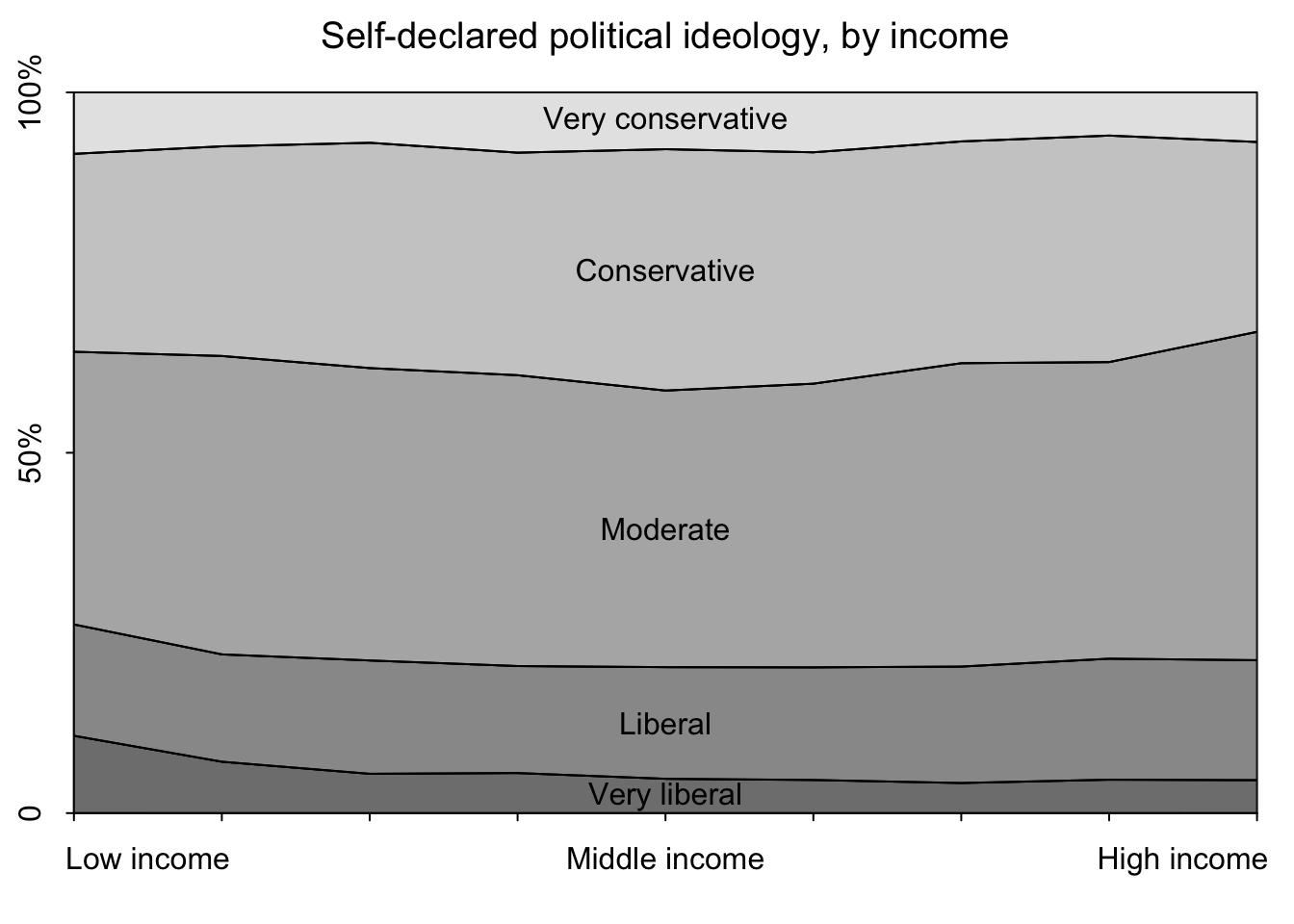
I’ll recreate the two plots using tidyverse and ggplot. I referenced this article by the Pew Research Center which shows how to calculated weighted estimates.
pew_pre <- pew_pre %>%
  mutate(
    # create an integer column for income levels
    inc = as.numeric(income),
    # remove "dk/refuse" value for income
    inc = case_when(
      inc == 10 ~ NA,
      TRUE ~ inc
    ),
    # set political party integer column
    pid0 = as.numeric(party),
    # set lean integer column
    lean0 = as.numeric(partyln),
    # set ideology integer column
    ideology0 = as.numeric(ideo),
    # re-assign party values
    pid = case_when(
      pid0 == 2 ~ 5, # Repubican
      pid0 == 3 ~ 1, # Democrat
      lean0 == 2 ~ 4, # Lean Republican
      lean0 == 4 ~ 2, # Lean Democrat
      is.na(pid0) ~ NA,
      TRUE ~ 3 # Independent
    ),
    # reassign ideology values
    ideology = case_when(
      ideology0 == 2 ~ 5, # Very conservative
      ideology0 == 3 ~ 4, # Conservative
      ideology0 == 6 ~ 1, # Very liberal
      ideology0 == 5 ~ 2, # Liberal
      is.na(ideology0) ~ NA,
      TRUE ~ 3 # Moderate
    )
  )

# constants
n_inc <- max(pew_pre$inc, na.rm = TRUE)
n_pid <- max(pew_pre$pid, na.rm = TRUE)
n_ideology <- max(pew_pre$ideology, na.rm = TRUE)
# calculate income proportions using population weight
inc_totals <- pew_pre %>% group_by(
inc
) %>% summarize(
total_inc = n()
)
pid_weighted_estimates <- pew_pre %>% dplyr::left_join(
inc_totals
) %>% group_by(
inc,
pid
) %>% summarise(
weighted_n = sum(weight)
) %>% mutate(
weighted_group_size = sum(weighted_n),
weighted_estimate = weighted_n / weighted_group_size
) %>% arrange(
inc
)Joining with `by = join_by(inc)`
`summarise()` has grouped output by 'inc'. You can override using the `.groups`
argument.DT::datatable(pid_weighted_estimates)ggplot(pid_weighted_estimates, aes(x=inc, y=weighted_estimate)) +
geom_area(aes(group = pid, fill = pid), position = position_stack(reverse = TRUE), show.legend = FALSE) +
annotate("text", x=5, y=.2, label="Democrat", color="white") +
annotate("text", x=5, y=.425, label="Lean Dem.", color="white") +
annotate("text", x=5, y=.55, label="Independent", color="white") +
annotate("text", x=5, y=.68, label="Lean Rep.") +
annotate("text", x=5, y=.87, label="Republican") +
scale_x_continuous("Average Income Level", breaks=c(1,5,9), labels = c("Low Income", "Middle Income", "High Income"), , expand = c(0, 0)) +
scale_y_continuous("Proportion of Sample", breaks=c(0,.5, 1), labels = c("0%", "50%", "100%"), expand = c(0, 0)) +
theme(
plot.margin = margin(3, 3, 2.5, 1, "lines"),
panel.border = element_rect(colour = "black", fill=NA, size=1),
plot.title = element_text(size=14,hjust = 0.5),
axis.text = element_text(size = 10)
) +
ggtitle("Party Identification by Income Levels")Warning: Removed 6 rows containing non-finite values (`stat_align()`).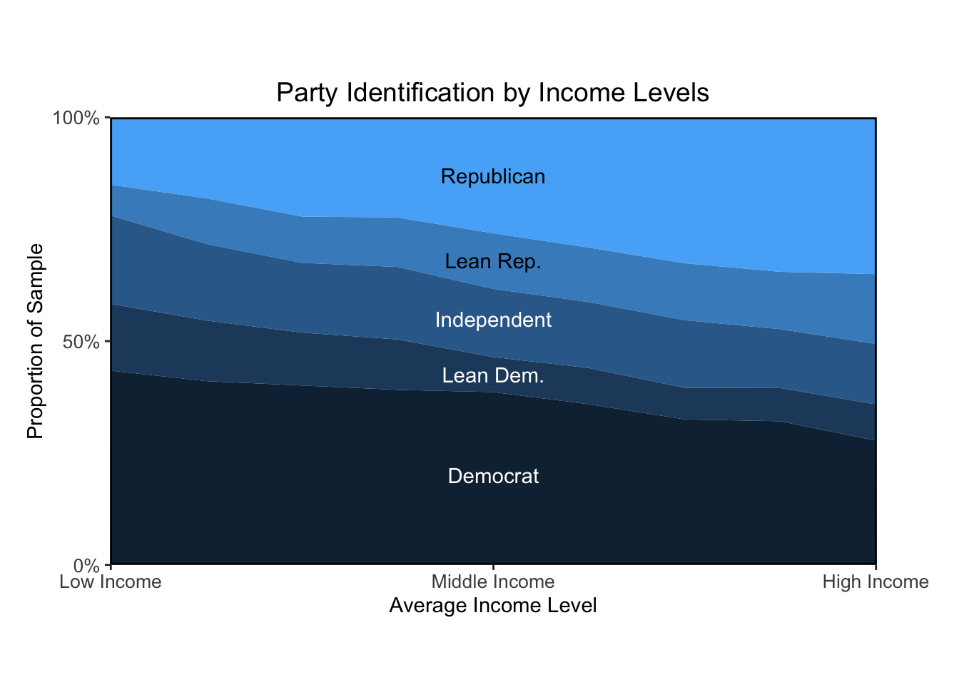
# ideology data prep
ideo_weighted_estimates <- pew_pre %>% dplyr::left_join(
  inc_totals
) %>% group_by(
  inc,
  ideology
) %>% summarise(
  weighted_n = sum(weight)
) %>% mutate(
  weighted_group_size = sum(weighted_n),
  weighted_estimate = weighted_n / weighted_group_size
) %>% arrange(
  inc
)
Joining with `by = join_by(inc)`
`summarise()` has grouped output by 'inc'. You can override using the `.groups`
argument.DT::datatable(ideo_weighted_estimates)ggplot(ideo_weighted_estimates, aes(x=inc, y=weighted_estimate)) +
geom_area(aes(group = ideology, fill = ideology), position = position_stack(reverse = TRUE), show.legend = FALSE) +
annotate("text", x=5, y=.03, label="Very Liberal", color="white", size=3) +
annotate("text", x=5, y=.13, label="Liberal", color="white", size=3) +
annotate("text", x=5, y=.4, label="Moderate", color="white", size=3) +
annotate("text", x=5, y=.75, label="Conservative", size=3) +
annotate("text", x=5, y=.95, label="Very Conservative", size=3) +
scale_x_continuous("Average Income Level", breaks=c(1,5,9), labels = c("Low Income", "Middle Income", "High Income"), , expand = c(0, 0)) +
scale_y_continuous("Proportion of Sample", breaks=c(0,.5, 1), labels = c("0%", "50%", "100%"), expand = c(0, 0)) +
theme(
plot.margin = margin(3, 3, 2.5, 1, "lines"),
panel.border = element_rect(colour = "black", fill=NA, size=1),
plot.title = element_text(size=14,hjust = 0.5),
axis.text = element_text(size = 10)
) +
ggtitle("Ideology by Income Levels")Warning: Removed 6 rows containing non-finite values (`stat_align()`).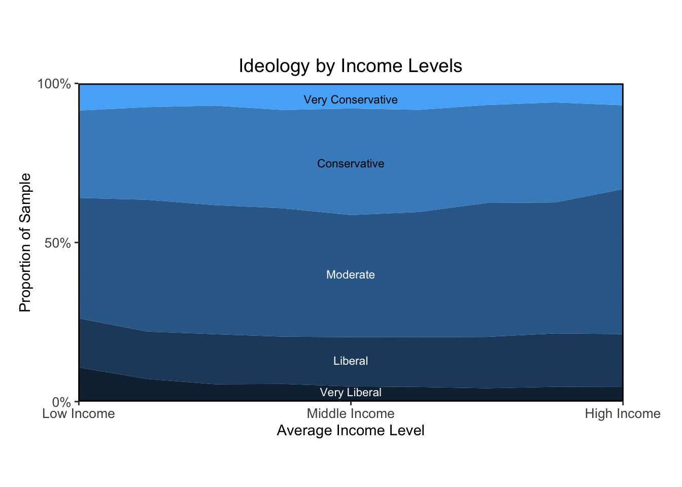
Overall, I think the plots I made look pretty similar to the textbook’s. The main bottleneck was learning how to calculate proportions based on weighted estimates. Once that took shape, I was able to figure out how to present the data visually in a way that resembles the authors’ approach.
The figure “Ideology by Income Levels” shows that the proportion of political liberals, moderates, and conservatives is about the same for all income levels. The figure “Party Identification by Income Levels” shows a strong relation between income and Republican partisanship, at least as of 2008. The partisanship and ideology example is a reminder that even very similar measures can answer quite different questions.
Data analysis reaches a dead end if we have poor data.
Two reasons for discussing measurement:
we need to understand what our data actually mean, otherwise we cannot extract the right information
learning about accuracy, reliability and validity will set a foundation for understanding variance, correlation, and error, which will be useful in setting up linear models in the forthcoming chapters
The property of being precise enough is a combination of the properties of the scale and what we are trying to use it for.
In social science, the way to measure what we are trying to measure is not as transparent as it is in everyday life.
Other times, the thing we are trying to measure is pretty straightforward, but a little bit fuzzy, and the ways to tally it up aren’t obvious.
Sometimes we are trying to measure something that we all agree has meaning, but which is subjective for every person and does not correspond to a “thing” we can count or measure with a ruler.
Attitudes are private; you can’t just weigh them or measure their widths.
It can be helpful to take multiple measurements on an underlying construct of interest.
A measure is valid to the degree that it represents what you are trying to measure. Asking people how satisfied they are with some government service might not be considered a valid measure of the effectiveness of that service.
Valid measures are ones in which there is general agreement that the observations are closely related to the intended construct.
validity: the property of giving the right answer on average across a wide range of plausible scenarios. To study validity in an empirical way, ideally you want settings in which there is an observable true value and multiple measurements can be taken.
A reliable measure is one that is precise and stable. We would hope the variability in our sample is due to real differences among people or things, and not due to random error incurred during the measurement process.
selection: the idea that the data you see may be a nonrepresentative sample of a larger population you will not see.
In addition to selection bias, there are also biases from nonresponse to particular survey items, partially observed measurements, and choices in coding and interpretation of data.
health_data_path = file.path(data_root_path, "HealthExpenditure/data/healthdata.txt")
health <- read.table(health_data_path, header=TRUE)
DT::datatable(head(health))par(mgp=c(1.7,.5,0), tck=-.01, mar=c(3,3,.1,.1))
ggplot(data=health, aes(x=spending, y=lifespan, label=country)) +
geom_text() +
labs(x="Health care spending (PPP US$)",y="Life expectancy (years)") +
theme(
panel.border = element_rect(colour = "black", fill=NA, size=1),
panel.background = element_rect(fill = 'white'),
aspect.ratio = 0.5
) 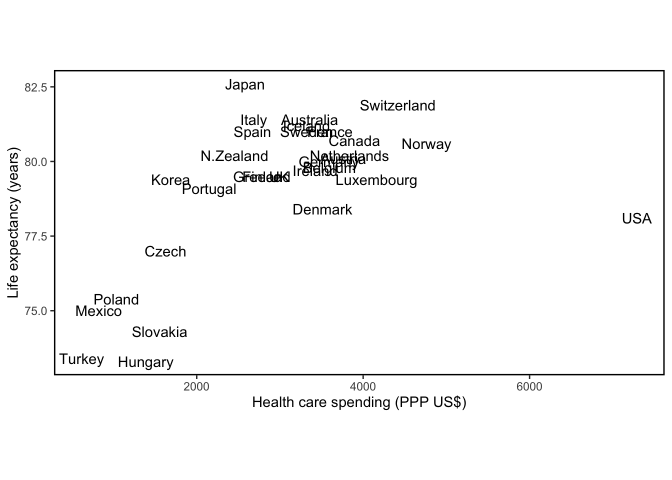
The graph shows the exceptional position of the United States (highest health care spending, low life expectancy) and also shows the relation between spending and lifespan in other countries.
At least in theory, you can display five variables easily with a scatterplot:
x position
y position
symbol
symbol size
symbol color
We prefer clearly distinguishable colors or symbols such as open circles, solid circles, crosses and dots. When a graph has multiple lines, label them directly.
Looking at data in unexpected ways can lead to discovery.
We can learn by putting multiple related graphs in a single display.
There is no single best way to display a dataset.
In the code chunks below I’ll recreate plots 2.6, 2.7, 2.8 and 2.9 using their code provided in the supplemental website.
allnames_path = file.path(data_root_path, "Names/data/allnames_clean.csv")
allnames <- read.csv(allnames_path)
DT::datatable(head(allnames), options=list(scrollX=TRUE))
# create a vector identifying which rows have Female names (TRUE) and which have Male names (FALSE)
girl <- as.vector(allnames$sex) == "F"
# Since there is a `names` base R function, I'm renaming the names vector to names_vec
names_vec <- as.vector(allnames$name)# plot data
# calculate the number of characters in each name
namelength <- nchar(names_vec)
# create a vector of last letters of each name
lastletter <- substr(names_vec, namelength, namelength)
# create a vector of first letters of each name
firstletter <- substr(names_vec, 1, 1)
# plotting function
# i am renaming it to names_histogram since there is an `arm` package function called `discrete.histogram`
names_histogram <- function(x, prob, prob2=NULL, xlab="x", ylab="Probability", xaxs.label=NULL, yaxs.label=NULL, bar.width=NULL, ...) {
if (length(x) != length(prob)) stop()
x.values <- sort (unique(x))
n.x.values <- length (x.values)
gaps <- x.values[2:n.x.values] - x.values[1:(n.x.values-1)]
if (is.null(bar.width)) bar.width <- min(gaps)*.2
par(mar=c(3,3,2,2), mgp=c(1.7,.3,0), tck=0)
plot(range(x)+c(-1,1)*bar.width, c(0,max(prob)),
xlab=xlab, ylab=ylab, xaxs="i", xaxt="n", yaxs="i",
yaxt=ifelse(is.null(yaxs.label),"s","n"), bty="l", type="n", ...)
if (is.null(xaxs.label)){
axis(1, x.values)
}
else {
n <- length(xaxs.label[[1]])
even <- (1:n)[(1:n)%%2==0]
odd <- (1:n)[(1:n)%%2==1]
axis(1, xaxs.label[[1]][even], xaxs.label[[2]][even], cex.axis=.9)
axis(1, xaxs.label[[1]][odd], xaxs.label[[2]][odd], cex.axis=.9)
}
if (!is.null(yaxs.label)){
axis(2, yaxs.label[[1]], yaxs.label[[2]], tck=-.02)
}
for (i in 1:length(x)){
polygon(x[i] + c(-1,-1,1,1)*bar.width/2, c(0,prob[i],prob[i],0),
border="gray10", col="gray10")
if (!is.null(prob2))
polygon(x[i] + c(-1,-1,1,1)*bar.width/10, c(0,prob2[i],prob2[i],0),
border="red", col="black")
}
}
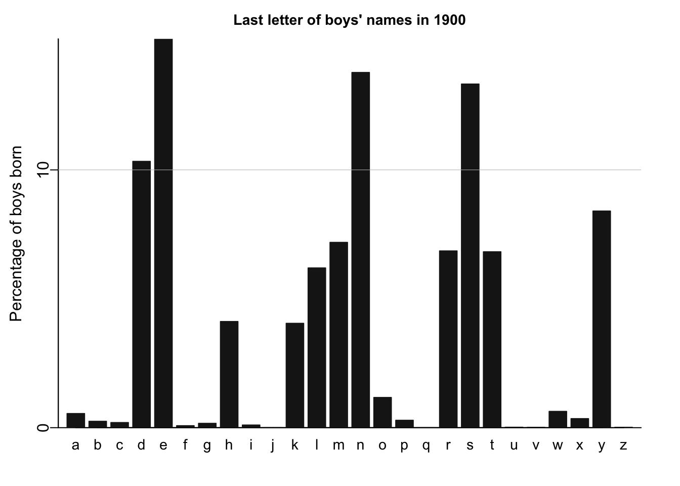
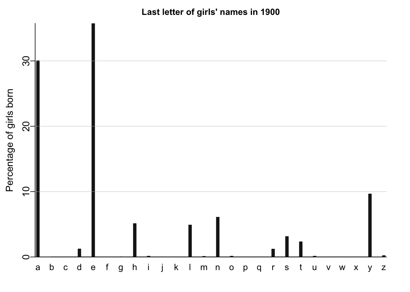
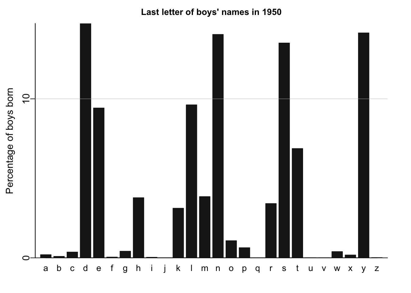
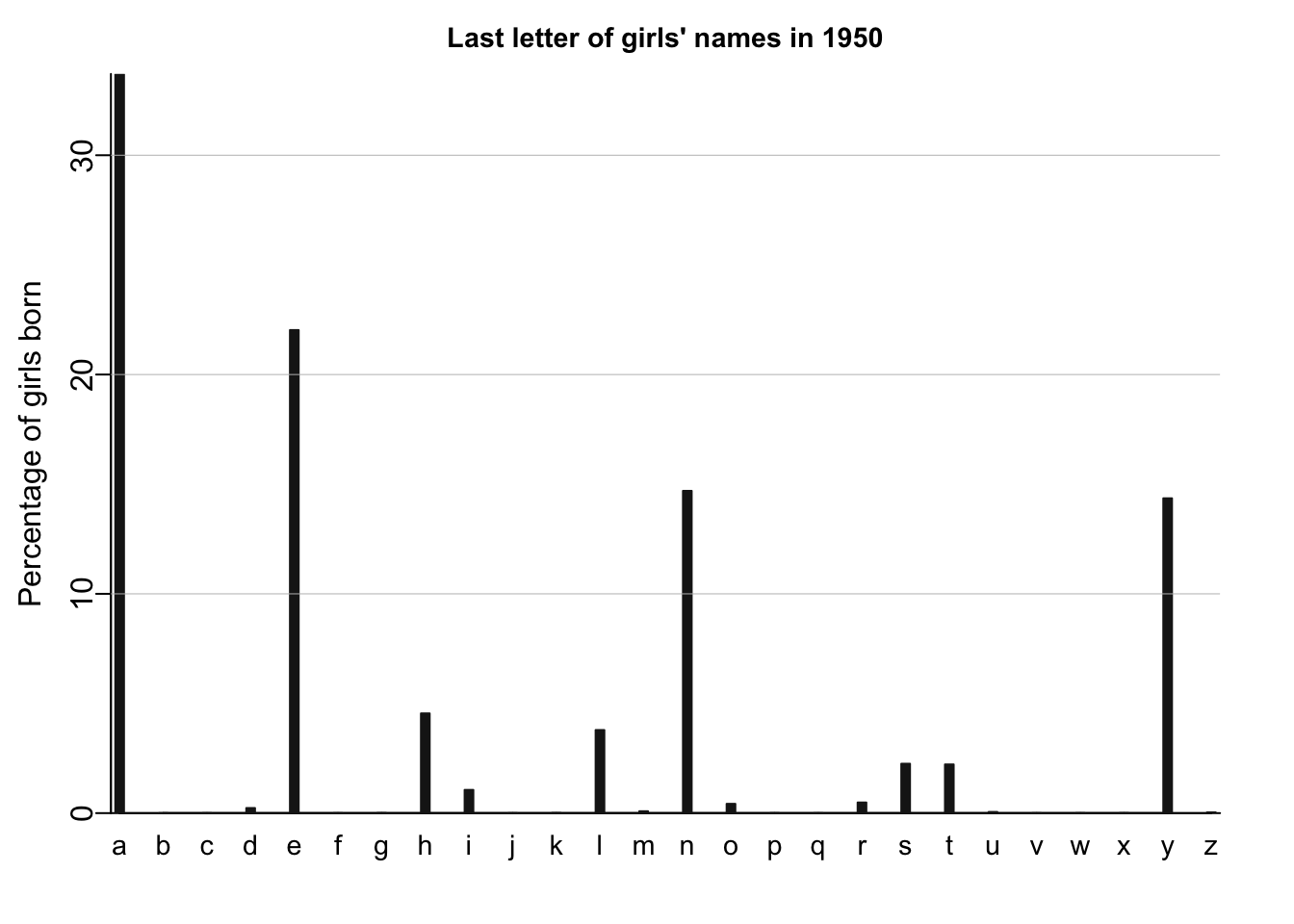
for (year in c(1900,1950,2010)){
# get the column X1900, X1950 and X2010 from the data.frame `allnames`
thisyear <- allnames[,paste("X",year,sep="")]
# create 2D empty arrays to store Male and Female last and first letter of names
lastletter.by.sex <- array(NA, c(26,2))
firstletter.by.sex <- array(NA, c(26,2))
# construct the 2D arrays of Male/Female last/first letter of names
for (i in 1:26){
lastletter.by.sex[i,1] <- sum(thisyear[lastletter==letters[i] & girl])
lastletter.by.sex[i,2] <- sum(thisyear[lastletter==letters[i] & !girl])
firstletter.by.sex[i,1] <- sum(thisyear[firstletter==LETTERS[i] & girl])
firstletter.by.sex[i,2] <- sum(thisyear[firstletter==LETTERS[i] & !girl])
}
# plot the histogram for the given year
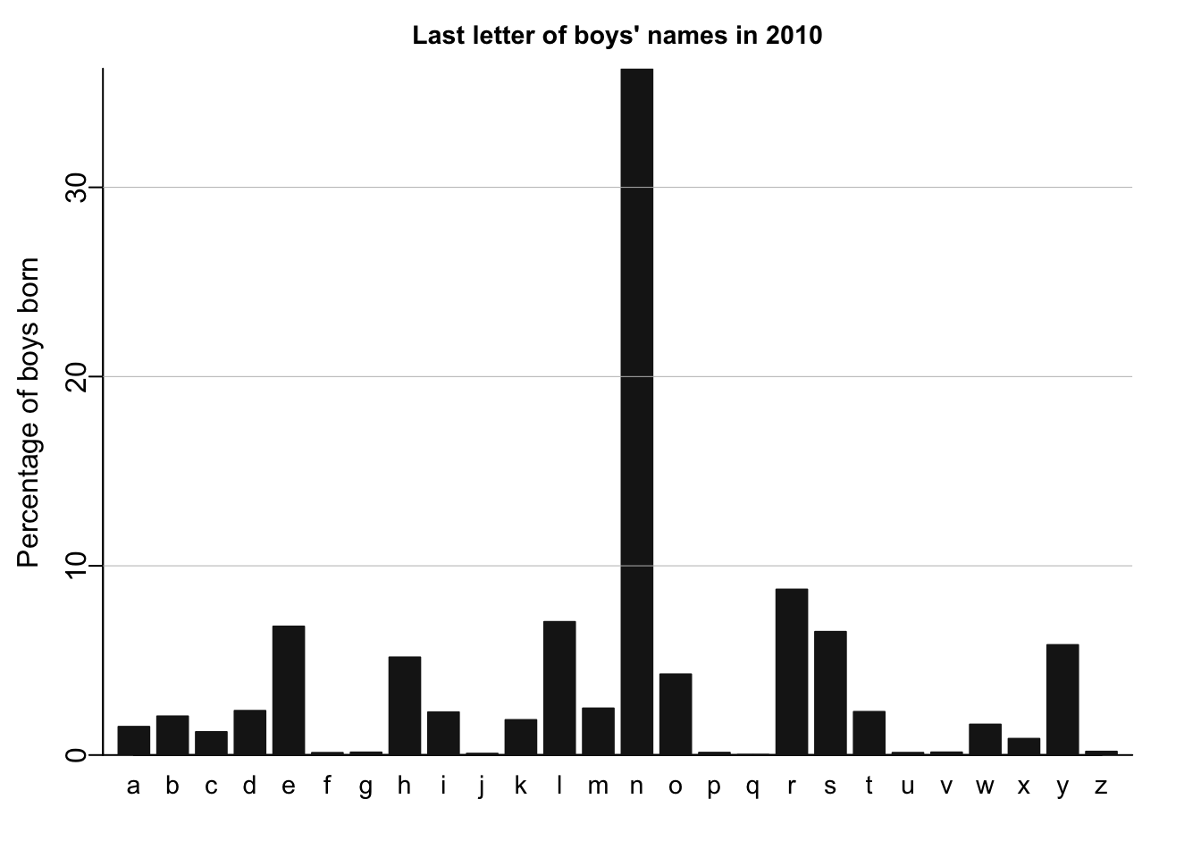
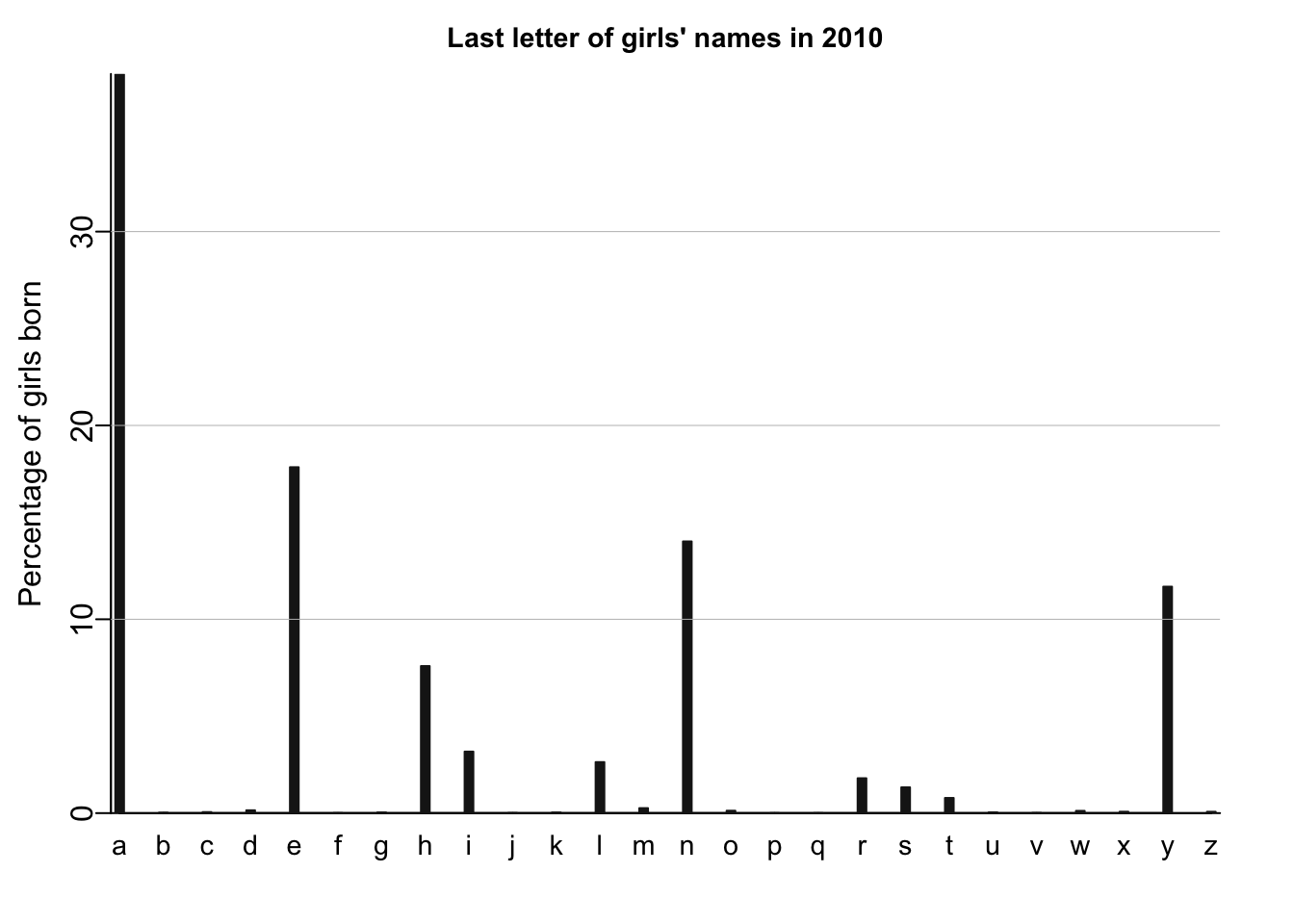
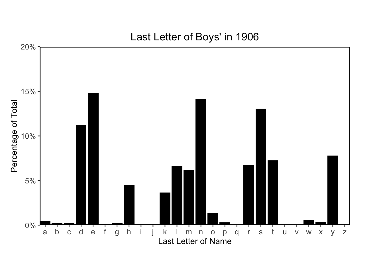
names_histogram(1:26, 100*(lastletter.by.sex[,2])/sum(lastletter.by.sex[,2]), xaxs.label=list(1:26,letters), yaxs.label=list(seq(0,30,10),seq(0,30,10)), xlab="", ylab="Percentage of boys born", main=paste("Last letter of boys' names in", year), cex.axis=.9, cex.main=.9, bar.width=.8)
for (y in c(10,20,30)) abline (y,0,col="gray",lwd=.5)
names_histogram(1:26, 100*(lastletter.by.sex[,1])/sum(lastletter.by.sex[,1]), xaxs.label=list(1:26,letters), yaxs.label=list(seq(0,30,10),seq(0,30,10)), xlab="", ylab="Percentage of girls born", main=paste("Last letter of girls' names in", year), cex.main=.9)
# adding the horizontal grid lines for the girls plots
for (y in c(10,20,30)) abline (y,0,col="gray",lwd=.5)
}
I’ll recreate similar plots using tidyverse and ggplot.
First, I’ll make the data long (instead of it’s current wide shape) so that I can aggregate the data more easily for plotting:
# reshape the data to make it longer
allnames_long <- allnames %>% rename(
  id = 'X'
) %>% pivot_longer(
  starts_with("X"),
  names_to = "year",
  values_to = "name_n"
) %>% mutate(
  # remove X at start of the four-digit year
  year = str_remove(year, "X"),
  # extract last letter of each name
  last_letter = str_sub(name, -1)
)

DT::datatable(head(allnames_long))
I then aggregate the data by year, sex and last letter, and calculate the count and percentage of last letters in each year for each sex:
allnames_agg <- allnames_long %>% group_by(
  year,
  sex,
  last_letter
) %>% summarise(
  last_letter_n = sum(name_n)
) %>% mutate(
  total_n = sum(last_letter_n),
  last_letter_pct = last_letter_n / total_n
)
`summarise()` has grouped output by 'year', 'sex'. You can override using the
`.groups` argument.DT::datatable(head(allnames_agg, n=30))I then plot one year’s data to make sure I’m getting the same result as the textbook:
ggplot(allnames_agg %>% filter(year == "1900", sex == "F"), aes(x = last_letter, y = last_letter_pct)) +
  geom_bar(stat="identity", fill="black") +
  theme(
    plot.margin = margin(3, 3, 2.5, 1, "lines"),
    panel.border = element_rect(color = "black", fill=NA, size=1),
    panel.background = element_rect(color = "white", fill=NA),
    plot.title = element_text(size=14,hjust = 0.5),
    axis.text = element_text(size = 10)
  ) +
  scale_x_discrete("Last Letter of Name", expand = c(0, 0)) +
  scale_y_continuous("Percentage of Total", limits=c(0,0.4), breaks=c(0,.1,.2,.3,.4), labels=c("0%", "10%", "20%", "30%", "40%"), expand = c(0, 0)) +
  ggtitle("Last Letter of Girls' Names in 1900")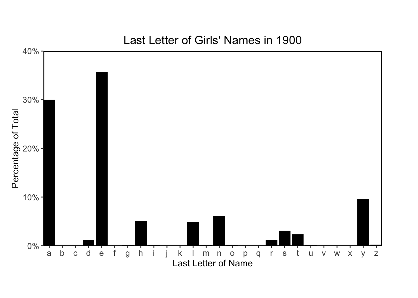
Finally I’ll plots histograms to match figures 2.6 and 2.7:
# plotting function
plot_last_letter_distribution <- function(year_arg, sex_arg) {
# prepare string for plot title
title_sex <- if(sex_arg == 'F') "Girls'" else "Boys'"
title_str <- paste("Last Letter of", title_sex, "in", year_arg)
# prep data
plot_data <- allnames_agg %>% filter(year == year_arg, sex == sex_arg)
# calculate y-axis limits, break points and labels
# calculate max y limit to 0.05 more than the nearest 0.05
limits_max <- round(max(plot_data$last_letter_pct)/0.05) * 0.05 + 0.05
# calculate y-axis breaks
breaks_val = seq(0, limits_max, by=0.05)
# calculate y-axis labels
labels_val = c()
for (val in breaks_val) {
labels_val <- append(labels_val, paste0(val*100, "%"))
}
print(ggplot(plot_data, aes(x = last_letter, y = last_letter_pct)) +
geom_bar(stat="identity", fill="black") +
theme(
plot.margin = margin(3, 3, 2.5, 1, "lines"),
panel.border = element_rect(color = "black", fill=NA, size=1),
panel.background = element_rect(color = "white", fill=NA),
plot.title = element_text(size=14,hjust = 0.5),
axis.text = element_text(size = 10)
) +
scale_x_discrete("Last Letter of Name", expand = c(0, 0)) +
scale_y_continuous("Percentage of Total", limits = c(0, limits_max), breaks = breaks_val, labels = labels_val, expand = c(0, 0)) +
ggtitle(title_str)
)
}
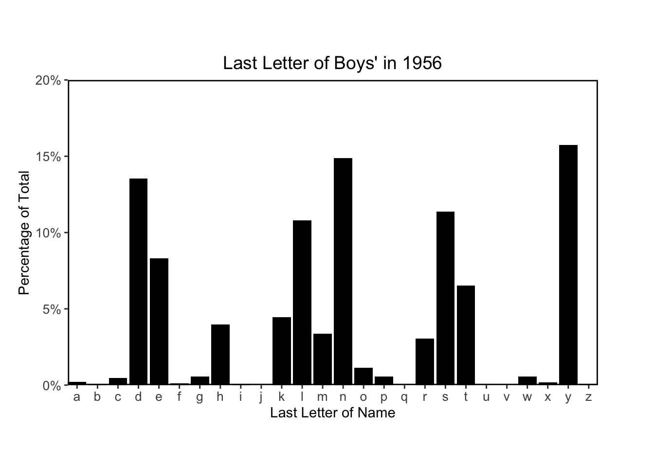
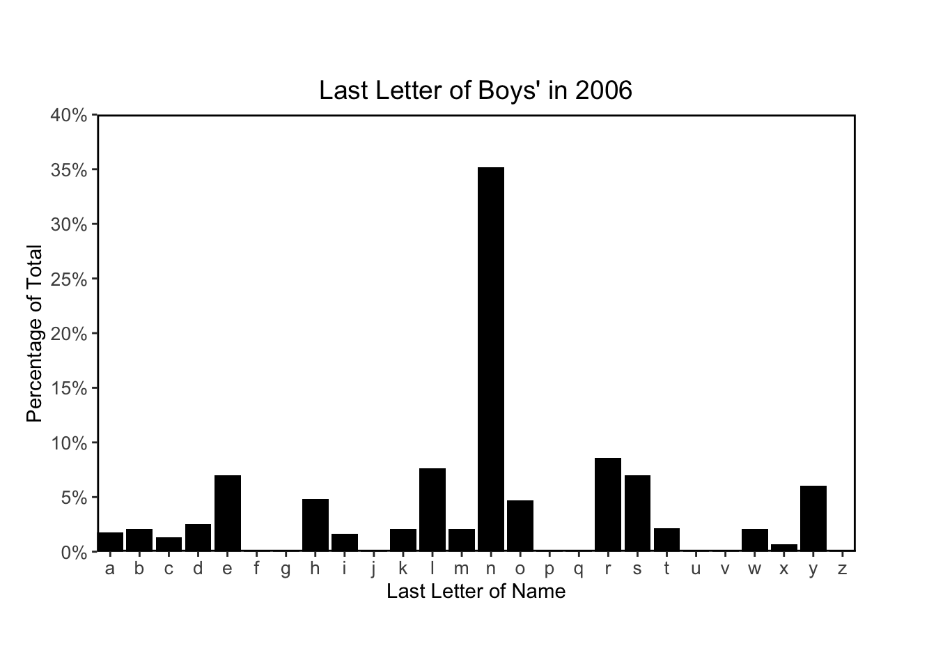
for (year in c(1906, 1956, 2006)) {
plot_last_letter_distribution(year, sex = 'M')
}
The following code chunks recreate Figure 2.8 using their code provided on the supplemental website:
# define full range of years in the dataset
yrs <- 1880:2010

# total number of years
n.yrs <- length(yrs)

# create empyt 3D arrays to hold last and first letter frequencies
lastletterfreqs <- array(NA, c(n.yrs,26,2))
firstletterfreqs <- array(NA, c(n.yrs,26,2))

# define the names of each dimension of the letter frequency 3D arrays
# as the list of years, letters and the list c("girls", "boys")
dimnames(lastletterfreqs) <- list(yrs, letters, c("girls","boys"))
dimnames(firstletterfreqs) <- list(yrs, letters, c("girls","boys"))

# construct the arrays lastletterfreqs and fistletterfreqs
for (i in 1:n.yrs){
  thisyear <- allnames[,paste("X",yrs[i],sep="")]
  for (j in 1:26){
    # sum of last letters for girls
    lastletterfreqs[i,j,1] <- sum(thisyear[lastletter==letters[j] & girl])

    # sum of last letters for boys
    lastletterfreqs[i,j,2] <- sum(thisyear[lastletter==letters[j] & !girl])

    # sum o first letters for girls
    firstletterfreqs[i,j,1] <- sum(thisyear[firstletter==LETTERS[j] & girl])

    # sum of laster letters for boys
    firstletterfreqs[i,j,2] <- sum(thisyear[firstletter==LETTERS[j] & !girl])
  }
  for (k in 1:2){
    # percentage of each last letter (of all last letters that year)
    lastletterfreqs[i,,k] <- lastletterfreqs[i,,k]/sum(lastletterfreqs[i,,k])

    # percentage of each first letter (of all first letters that year)
    firstletterfreqs[i,,k] <- firstletterfreqs[i,,k]/sum(firstletterfreqs[i,,k])
  }
}
# plot of percentage of last letters over time
# plot settings
par(mar=c(2,3,2,1), mgp=c(1.7,.3,0), tck=-.01)
# index of letters N, Y and D
popular <- c(14,25,4)
# width and line type for all letters except N, Y and D
width <- rep(.5,26)
type <- rep(1,26)
# width and line type for N, Y and D
width[popular] <- c(2,3,3)
type[popular] <- c(1,3,2)
plot(range(yrs), c(0,41), type="n", xlab="", ylab="Percentage of all boys' names that year", bty="l", xaxt="n", yaxt="n", yaxs="i", xaxs="i")
axis(1, seq(1900,2000,50))
axis(2, seq(0,40,20), paste(seq(0,40,20), "%", sep=""))
for (j in 1:26){
# I don't think the following two variables, `maxfreq` and `best` are used in plotting
maxfreq <- max(lastletterfreqs[,j,2])
best <- (1:n.yrs)[lastletterfreqs[,j,2]==maxfreq]
# plotting line for each letter for all years for boys
lines(yrs, 100*lastletterfreqs[,j,2], col="black", lwd=width[j], lty=type[j])
}
# plot annotations
text(2000, 35, "N")
text(1935, 20, "D")
text(1975, 15, "Y")
mtext("Last letters of boys' names", side=3, line=.5)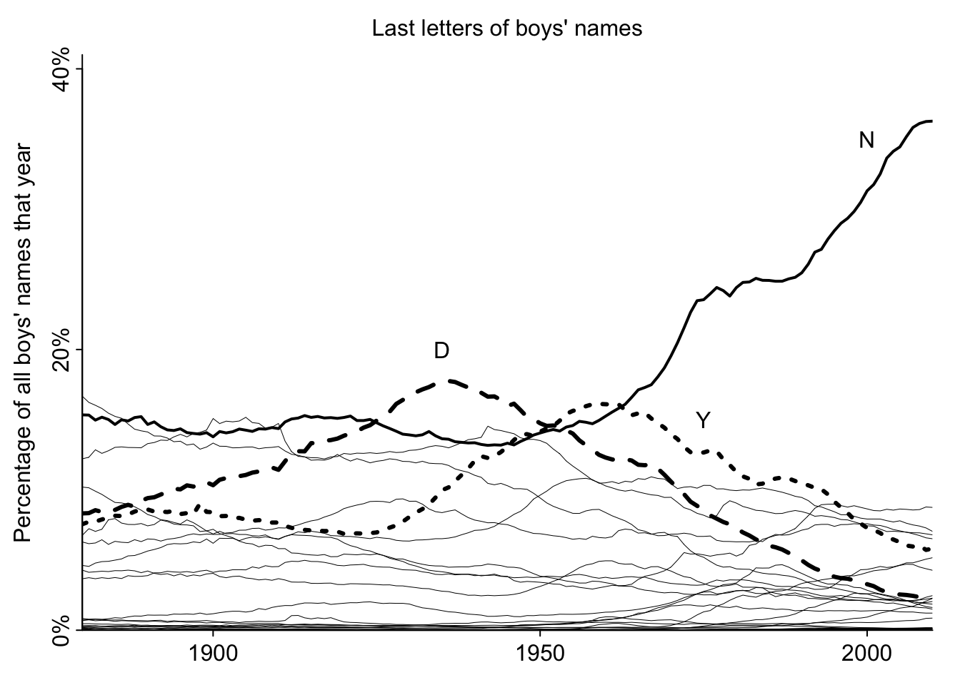
Next, I’ll recreate the plot of Figure 2.8 using tidyverse and ggplot for practice:
# define new linewidth vector

# index of letters N, Y and D
popular <- c(14,25,4)

# width and line type for all letters except N, Y and D
width <- rep(.25,26)

# width and line type for N, Y and D
width[popular] <- c(1,1,1)

ggplot(allnames_agg %>% filter(sex == "M"), aes(x=year, y=last_letter_pct, linetype=factor(last_letter), linewidth = factor(last_letter))) +
  geom_line(aes(group = last_letter)) +
  scale_linetype_manual(values = type, guide = "none") +
  scale_linewidth_manual(values = width, guide = "none") +
  scale_x_discrete("Year", breaks = c(1900, 1950, 2000), expand = c(0, 0)) +
  scale_y_continuous("Percentage of all boys' names that year", breaks = c(0, 0.1, 0.2, 0.3, 0.4), labels = c("0%", "10%", "20%", "30%", "40%"), expand = c(0, 0)) +
  ggtitle("Last letters of boys' names") +
  theme(
    panel.border = element_rect(color = "black", fill=NA, size=1),
    panel.background = element_rect(color = "white", fill=NA),
    plot.title = element_text(size=14,hjust = 0.5),
    axis.text = element_text(size = 10)
  ) +
  annotate("text", x = "2000", y = 0.35, label = "N") +
  annotate("text", x = "1935", y = 0.20, label = "D") +
  annotate("text", x = "1975", y = 0.15, label = "Y")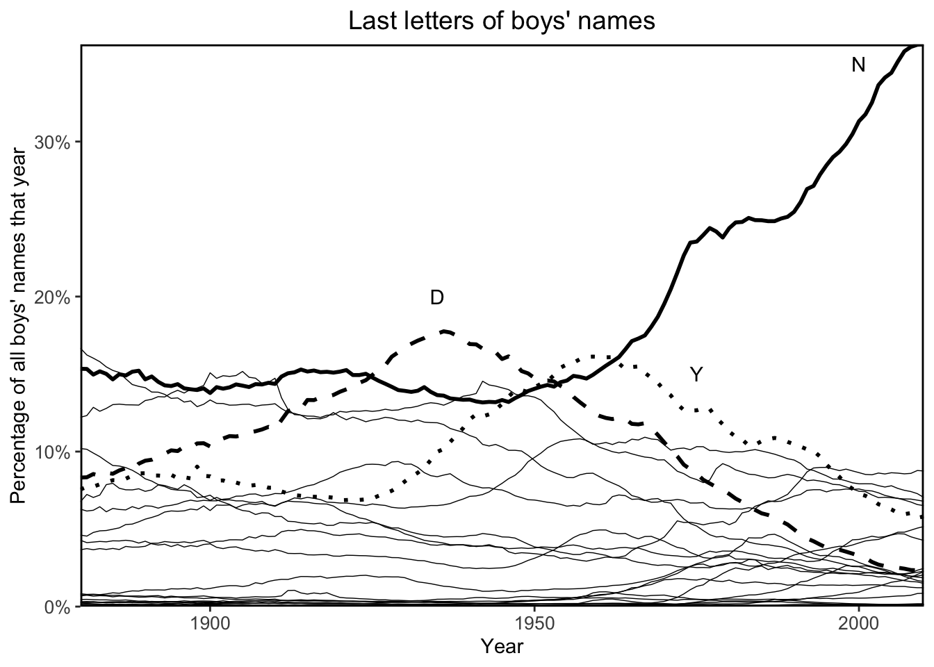
The following code chunks recreate Figure 2.9 using their code provided on the supplemental website:
# create empty 3D array to hold yearly percentage of top ten names
topten_percentage <- array(NA, c(length(yrs), 2))

for (i in 1:length(yrs)){
  # get data for the given year
  thisyear <- allnames[,paste("X",yrs[i],sep="")]

  # get boys' data for this year
  boy.totals <- thisyear[!girl]

  # calculate percentages of boys' names
  boy.proportions <- boy.totals/sum(boy.totals)

  # get total percentage of the top ten names
  index <- rev(order(boy.proportions))
  popularity <- boy.proportions[index]
  topten_percentage[i,2] <- 100*sum(popularity[1:10])

  # do the same for girls' top ten names
  girl.totals <- thisyear[girl]
  girl.proportions <- girl.totals/sum(girl.totals)
  index <- rev(order(girl.proportions))
  popularity <- girl.proportions[index]
  topten_percentage[i,1] <- 100*sum(popularity[1:10])
}
# plot settings
par(mar=c(4,2,1,0), mgp=c(1.3,.2,0), tck=-.02)
# plot girls and boys top ten name percentages over time
plot(yrs, topten_percentage[,2], type="l", xaxt="n", yaxt="n", xaxs="i", yaxs="i", ylim=c(0,45), bty="l", xlab="Year", ylab="", cex.lab=.8)
lines(yrs, topten_percentage[,1])
axis(1, c(1900,1950,2000), cex.axis=.8)
axis(2, c(0,20,40), c("0%","20%","40%"), cex.axis=.8)
text(1902, 35, "Boys", cex=.75, adj=0)
text(1911, 20, "Girls", cex=.75, adj=0)
mtext("Total popularity of top ten names each year, by sex", cex=.8)
mtext("Source: Social Security Administration, courtesy of Laura Wattenberg", 1, 2.5, cex=.5, adj=0)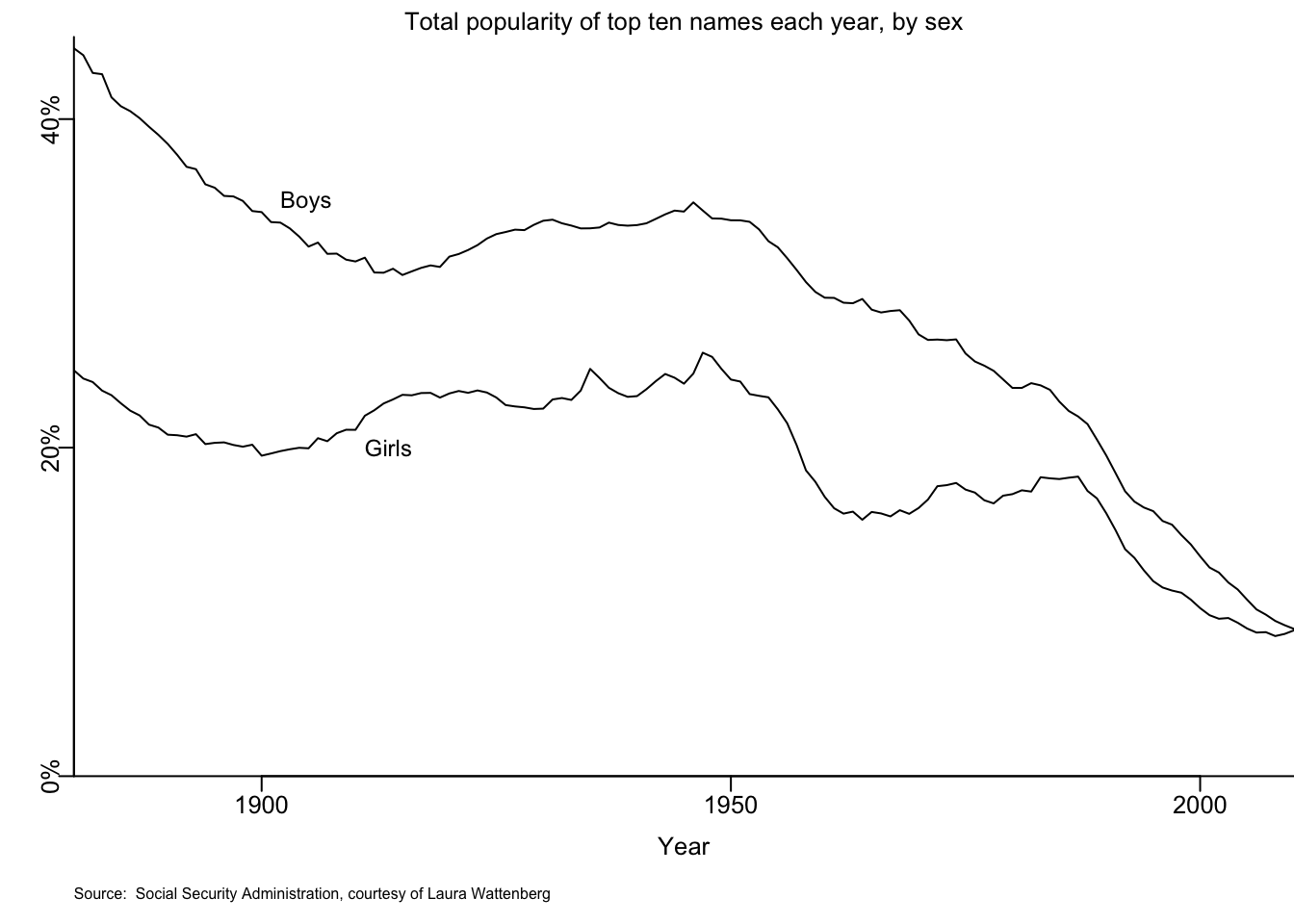
Next, I’ll recreate the plot of Figure 2.9 using tidyverse and ggplot for practice:
DT::datatable(head(allnames_long))allnames_topten_names <- allnames_long %>% group_by(
year,
sex
) %>% mutate(
name_pct = name_n / sum(name_n)
) DT::datatable(head(allnames_topten_names %>% arrange(year, sex, desc(name_pct))))allnames_top_ten_pct <- allnames_topten_names %>% arrange(
year,
sex,
desc(name_pct)
) %>% group_by(
year,
sex
) %>% slice(
1:10
) %>% summarise(
top_ten_pct = sum(name_pct)
)`summarise()` has grouped output by 'year'. You can override using the
`.groups` argument.DT::datatable(head(allnames_top_ten_pct))# plot the lines
ggplot(allnames_top_ten_pct, aes(x = year, y = top_ten_pct)) +
geom_line(aes(group = sex)) +
scale_x_discrete("Year", breaks = c(1900, 1950, 2000), expand = c(0, 0)) +
scale_y_continuous("Percentage of top ten names that year", breaks = c(0, 0.1, 0.2, 0.3, 0.4, 0.5), labels = c("0%", "10%", "20%", "30%", "40%", "50%"), expand = c(0, 0)) +
ggtitle("Total popularity of top ten names each year, by sex") +
theme(
panel.border = element_rect(color = "black", fill=NA, size=1),
panel.background = element_rect(color = "white", fill=NA),
plot.title = element_text(size=14,hjust = 0.5),
axis.text = element_text(size = 10)
) +
annotate("text", x = "1902", y = 0.36, label = "Boys") +
annotate("text", x = "1911", y = 0.19, label = "Girls")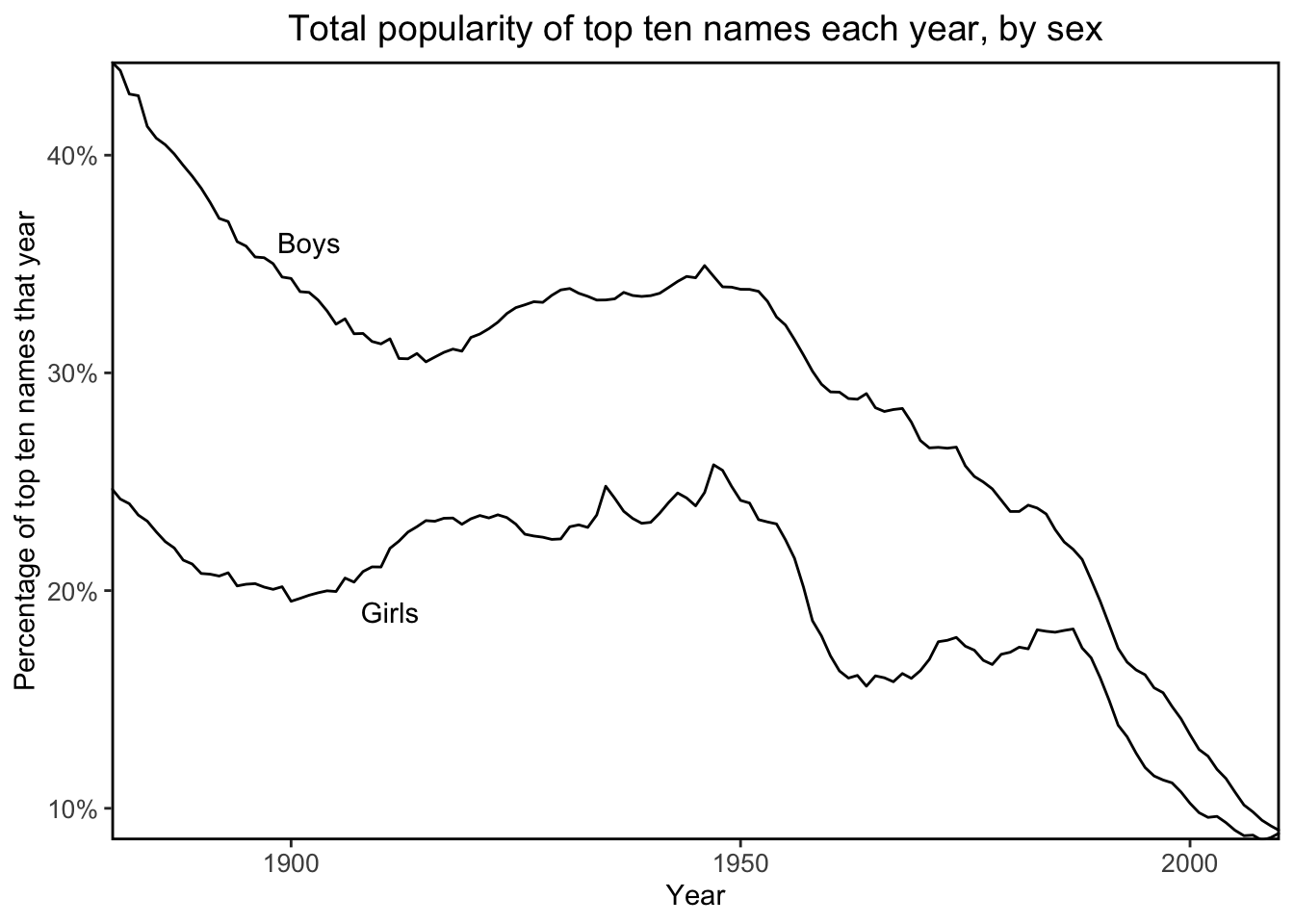
Realistically, it can be difficult to read a plot with more than two colors.
Constructing a two-way grid of plots to represent two more variables, an approach of small multiples can be more effective than trying to cram five variables onto a single plot.
In the following code chunks, I’ll recreate Figure 2.10 following their code provided on the supplemental website.
# view the data
congress[[27]][1,]
[1] 1948 1 1 -1 127802 103294congress[[28]][1,][1] 1950 1 1 1 134258 96251congress[[37]][10,][1] 1968 3 1 -1 0 140419congress[[38]][10,][1] 1970 3 1 -1 0 117045congress[[47]][20,][1] 1988 4 1 -1 86623 131824congress[[48]][50,][1] 1990 13 11 1 36286 0# plot settings
par(mfrow=c(3,5), mar=c(0.1,3,0,0), mgp=c(1.7, .3, 0), tck=-.02, oma=c(1,0,2,0))
# plot data for each of the selected year pairs: 1948/50, 1968/70, 1988/90
for (i in c(27, 37, 47)) {
# calculate year based on index
year <- 1896 + 2*(i-1)
# get the data for the first election year
cong1 <- congress[[i]]
# get data for the next election year
cong2 <- congress[[i+1]]
# the second column contains the state code
state_code <- cong1[,2]
# convert from state code to region index
region <- floor(state_code/20) + 1
# the fourth column contains whether the election has an incumbent
inc <- cong1[,4]
# the fifth and sixth columns contain democrat and republican vote counts
dvote1 <- cong1[,5]/(cong1[,5] + cong1[,6])
dvote2 <- cong2[,5]/(cong2[,5] + cong2[,6])
# their definition of an election being "contested" if the
# proportion of dem votes is between 20 and 80 percent each election year
contested <- (abs(dvote1 - 0.5)) < 0.3 & (abs(dvote2 - 0.5) < 0.3)
# plot function
plot(c(0, 1), c(0, 1), type="n", xlab="", ylab="", xaxt="n", yaxt="n", bty="n")
text(0.8, 0.5, paste(year,"\nto\n", year+2, sep=""), cex=1.1)
# four columns, one for each region
for (j in 1:4){
plot(c(.2, .8), c(-.4, .3), type="n", xlab= "" , ylab=if (j==1) "Vote swing" else "", xaxt="n", yaxt="n", bty="n", cex.lab=.9)
if (i==47) {
# x-axis labels for the final pair of elections 1988/90
text(c(.25, .5, .75), rep(-.4, 3), c("25%", "50%", "75%"), cex=.8)
abline(-.35, 0, lwd=.5, col="gray60")
segments(c(.25, .5, .75), rep(-.35, 35), c(.25, .5, .75), rep(-.37, 3), lwd=.5)
mtext("Dem. vote in election 1", side=1, line=.2, cex=.5)
}
# y-axis for each plot
axis(2, c(-0.25, 0, 0.25), c("-25%", "0", "25%"), cex.axis=.8)
abline(0, 0)
# region name above the first pair of elections 1948/50
if (i==27) mtext(region_name[j], side=3, line=1, cex=.75)
# plotting contested elections for the region with incumbent
ok <- contested & abs(inc)==1 & region==j
points(dvote1[ok], dvote2[ok] - dvote1[ok], pch=20, cex=.3, col="gray60")
# plotting contested elections for the region with open seats
ok <- contested & abs(inc)==0 & region==j
points(dvote1[ok], dvote2[ok] - dvote1[ok], pch=20, cex=.5, col="black")
}
}
Next, I’ll recreate similar plots with tidyverse and ggplot.
# get list of all .asc file paths
congress_data_folder <- file.path(data_root_path, "Congress/data")
congress_data_files <- list.files(congress_data_folder, full.names=TRUE, pattern = "*.asc")

# helper function which loads data into a CSV and adds a year column
read_congress_data <- function(fpath) {
  year_str = str_remove(basename(fpath), ".asc")

  out <- readr::read_table(
    fpath,
    col_names = c("state", "col2", "incumbent", "dem", "rep"),
    col_types = cols(state = "i", col2 = "c", incumbent = "i", dem = "i", rep = "i")
  ) %>% mutate(
    year = year_str
  )

  return(out)
}

# read all asc files into a single data.frame
# filter for the years in question
congress_data <- congress_data_files %>% map(
  read_congress_data
) %>% list_rbind(
) %>% filter(
  year %in% c(1948, 1950, 1968, 1970, 1988, 1990)
)
# view the data
DT::datatable(congress_data)Next, I’ll create two data.frames, cong1 and cong2 with 1948, 1968, 1988 and 1950, 1970, 1990 data, respectively, then merge them row-wise in order to perform year-to-year calculations:
# 1948, 1968, and 1988 data
cong1 <- congress_data %>% filter(
  year %in% c(1948, 1968, 1988)
) %>% rename(
  # rename columns to avoid duplicates later on when joining the two data.frames
  state1 = state,
  col21 = col2,
  incumbent1 = incumbent,
  dem1 = dem,
  rep1 = rep,
  year1 = year
) %>% mutate(
  # create a lookup value to join the two data.frames by
  election = case_when(
    year1 == 1948 ~ "1948 to 1950",
    year1 == 1968 ~ "1968 to 1970",
    year1 == 1988 ~ "1988 to 1990"
  ),
  lookup = paste0(state1, "-", col21, "-", election)
)

# 1950, 1970 and 1990 data
cong2 <- congress_data %>% filter(
  year %in% c(1950, 1970, 1990)
) %>% rename(
  # rename columns to avoid duplicates later on when joining the two data.frames
  state2 = state,
  col22 = col2,
  incumbent2 = incumbent,
  dem2 = dem,
  rep2 = rep,
  year2 = year
) %>% mutate(
  # create a lookup value to join the two data.frames by
  election = case_when(
    year2 == 1950 ~ "1948 to 1950",
    year2 == 1970 ~ "1968 to 1970",
    year2 == 1990 ~ "1988 to 1990"
  ),
  lookup = paste0(state2, "-", col22, "-", election)
)


# merge the two data.frames
cong <- cong1 %>% dplyr::left_join(
  cong2,
  by = "lookup"
) %>% mutate(
  # calculate democrat vote proportion
  dvote1 = dem1 / (dem1 + rep1),
  dvote2 = dem2 / (dem2 + rep2),
  # calculate difference in democrat vote proportion between election years
  dvote_diff= dvote2 - dvote1,
  # calculate whether an election is contested
  # an election is contested if the dem vote in both years is
  # between 20% and 80%
  contested = case_when(
    (abs(dvote1 - 0.5)) < 0.3 & (abs(dvote2 - 0.5) < 0.3) ~ 1,
    TRUE ~ 0
  ),
  # standardize incumbent flag in the first election year
  inc = abs(incumbent1),
  # remove values that are not applicable
  inc = na_if(inc, 9),
  inc = na_if(inc, 3),
  inc = as.character(inc),
  # calculate region code
  region = floor(state1/20) + 1
) %>% filter(
  # only include contested elections
  contested == 1,
  # only include four main regions
  region %in% c(1,2,3,4)
)

# %>% mutate(
#   # change region to text
#   region = case_when(
#     region == 1 ~ "Northeast",
#     region == 2 ~ "Midwest",
#     region == 3 ~ "South",
#     region == 4 ~ "West"
#   )
# )DT::datatable(cong, options=list(scrollX=TRUE))Finally, I can plot the data:
# labels for regions
region_labeller <- c(
  "1" = "Northeast",
  "2" = "Midwest",
  "3" =  "South",
  "4" = "West"
)

ggplot(cong, aes(x=dvote1, y = dvote_diff)) +
  geom_point(aes(color=inc, size=inc), show.legend = FALSE) +
  facet_grid(rows = vars(election.x), cols = vars(region), switch = "y", labeller = labeller(region = region_labeller)) +
  theme(
    panel.background = element_rect(fill = "white"),
    strip.placement = "outside",
    axis.line=element_line()
  ) +
  scale_color_manual(values = c("black", "grey"), na.translate = FALSE) +
  scale_size_manual(values = c(0.75, 0.5), na.translate = FALSE) +
  geom_abline(slope = 0, intercept = 0) +
  scale_y_continuous("Vote Swing", breaks = c(-0.25, 0, 0.25), labels = c("-25%", "0%", "25%")) +
  scale_x_continuous("Dem. Vote in Election 1", breaks = c(.25, .50, .75), labels = c("25%", "50%", "75%"))
Warning: Removed 38 rows containing missing values (`geom_point()`).
While I wasn’t able to get exactly the same output as the textbook, I’m content with the grid of plots I created with ggplot.
Avoid overwhelming the reader with irrelevant material.
Do not report numbers to too many decimal places. You should display precision in a way that respects the uncertainty and variability in the numbers being presented. It makes sense to save lots of digits for intermediate steps in computations.
You can often make a list or table of numbers more clear by first subtracting out the average (or for a table, row and column averages).
A graph can almost always be made smaller than you think and still be readable. This then leaves room for more plots on a grid, which then allows more patterns to be seen at once and compared.
Never display a graph you can’t talk about. Give a full caption for every graph (this explains to yourself and others what you are trying to show and what you have learned from each plot).
Avoid displaying graphs that have been made simply because they are conventional.
Three uses of graphs in statistical analysis:
The goal of any graph is communication to self and others. Graphs are comparisons: to zero, to other graphs, to horizontal lines, and so forth. The unexpected is usually not an “outlier” or aberrant point but rather a systematic pattern in some part of the data.
When making a graph, line things up so that the most important comparisons are clearest.
It can be helpful to graph a fitted model and data on the same plot. Another use of graphics with fitted models is to plot predicted datasets and compare them visually to actual data.
Aggregation bias: occurs when it is wrongly assumed that the trends seen in aggregated data also apply to individual data points.
I referenced this Missouri Department of Health & Senior Services page to learn more about how to calculate age-adjusted death rates.
In the following code chunks I’ll recreate Figures 2.11 and 2.12 using their code provided on the supplemental website.
# deaton <- read.table(root("AgePeriodCohort/data","deaton.txt"), header=TRUE)
ages_all <- 35:64
ages_decade <- list(35:44, 45:54, 55:64)
years_1 <- 1999:2013
mort_data <- as.list(rep(NA,3))
group_names <- c("Non-Hispanic white", "Hispanic white", "African American")

fpath_1 <- file.path(data_root_path, "AgePeriodCohort/data", "white_nonhisp_death_rates_from_1999_to_2013_by_sex.txt")
fpath_2 <- file.path(data_root_path, "AgePeriodCohort/data", "white_hisp_death_rates_from_1999_to_2013_by_sex.txt")
fpath_3 <- file.path(data_root_path, "AgePeriodCohort/data", "black_death_rates_from_1999_to_2013_by_sex.txt")
mort_data[[1]] <- read.table(fpath_1, header=TRUE)
mort_data[[2]] <- read.table(fpath_2, header=TRUE)
mort_data[[3]] <- read.table(fpath_3, header=TRUE)DT::datatable(mort_data[[1]])raw_death_rate <- array(NA, c(length(years_1), 3, 3))
male_raw_death_rate <- array(NA, c(length(years_1), 3, 3))
female_raw_death_rate <- array(NA, c(length(years_1), 3, 3))
avg_death_rate <- array(NA, c(length(years_1), 3, 3))
male_avg_death_rate <- array(NA, c(length(years_1), 3, 3))
female_avg_death_rate <- array(NA, c(length(years_1), 3, 3))
# k represents the 3 different race/ethnicity groups
for (k in 1:3){
data <- mort_data[[k]]
# the Male column is 0 for Female, 1 for Male
male <- data[,"Male"]==1
# j represents the 3 different age decades
# 35:44, 45:54, 55:64
for (j in 1:3){
# years1 is from 1999 to 2013
for (i in 1:length(years_1)){
ok <- data[,"Year"]==years_1[i] & data[,"Age"] %in% ages_decade[[j]]
# raw death rate calculated as
# 100,000 * deaths / population
raw_death_rate[i,j,k] <- 1e5*sum(data[ok,"Deaths"])/sum(data[ok,"Population"])
male_raw_death_rate[i,j,k] <- 1e5*sum(data[ok&male,"Deaths"])/sum(data[ok&male,"Population"])
female_raw_death_rate[i,j,k] <- 1e5*sum(data[ok&!male,"Deaths"])/sum(data[ok&!male,"Population"])
avg_death_rate[i,j,k] <- mean(data[ok,"Rate"])
male_avg_death_rate[i,j,k] <- mean(data[ok&male,"Rate"])
female_avg_death_rate[i,j,k] <- mean(data[ok&!male,"Rate"])
}
}
}par(mar=c(2.5, 3, 3, .2), mgp=c(2,.5,0), tck=-.01)
plot(range(years_1), c(1, 1.1), xaxt="n", yaxt="n", type="n", bty="l", xaxs="i", xlab="", ylab="Death rate relative to 1999", main="Age-adjusted death rates for non-Hispanic whites aged 45-54:\nTrends for women and men")
lines(years_1, male_avg_death_rate[,2,1]/male_avg_death_rate[1,2,1], col="blue")
lines(years_1, female_avg_death_rate[,2,1]/female_avg_death_rate[1,2,1], col="red")
axis(1, seq(1990,2020,5))
axis(2, seq(1, 1.1, .05))
text(2011.5, 1.075, "Women", col="red")
text(2010.5, 1.02, "Men", col="blue")
grid(col="gray")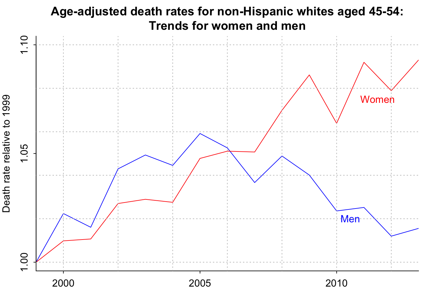
mean_age_45_54 <- function(yr){
  ages <- 45:54
  ok <- births$year %in% (yr - ages)
  return(sum(births$births[ok]*rev(ages))/sum(births$births[ok]))
}
number_of_deaths <- rep(NA, length(years_1))
number_of_people <- rep(NA, length(years_1))
avg_age <- rep(NA, length(years_1))
avg_age_census <- rep(NA, length(years_1))
# data for white non-hispanic death rates
data <- mort_data[[1]]
death_rate_extrap_1999 <- rep(NA, length(years_1))
death_rate_extrap_2013 <- rep(NA, length(years_1))
# data for Males
male <- data[,"Male"]==1
ok_1999 <- data[,"Year"]==1999 & data[,"Age"] %in% ages_decade[[2]]
death_rate_1999 <- (data[ok_1999 & male, "Deaths"] + data[ok_1999 & !male, "Deaths"])/(data[ok_1999 & male, "Population"] + data[ok_1999 & !male, "Population"])
ok_2013<- data[,"Year"]==2013 & data[,"Age"] %in% ages_decade[[2]]
death_rate_2013 <- (data[ok_2013 & male, "Deaths"] + data[ok_2013 & !male, "Deaths"])/(data[ok_2013 & male, "Population"] + data[ok_2013 & !male, "Population"])
age_adj_rate_flat <- rep(NA, length(years_1))
age_adj_rate_1999 <- rep(NA, length(years_1))
age_adj_rate_2013 <- rep(NA, length(years_1))
ok <- data[,"Age"] %in% ages_decade[[2]]
pop1999 <- data[ok & data[,"Year"]==1999 & male,"Population"] + data[ok & data[,"Year"]==1999 & !male,"Population"]
pop2013 <- data[ok & data[,"Year"]==2013 & male,"Population"] + data[ok & data[,"Year"]==2013 & !male,"Population"]
for (i in 1:length(years_1)){
ok <- data[,"Year"]==years_1[i] & data[,"Age"] %in% ages_decade[[2]]
number_of_deaths[i] <- sum(data[ok,"Deaths"])
number_of_people[i] <- sum(data[ok,"Population"])
avg_age[i] <- weighted.mean(ages_decade[[2]], data[ok & male,"Population"] + data[ok & !male,"Population"])
avg_age_census[i] <- mean_age_45_54(years_1[i])
rates <- (data[ok&male,"Deaths"] + data[ok&!male,"Deaths"])/(data[ok&male,"Population"] + data[ok&!male,"Population"])
age_adj_rate_flat[i] <- weighted.mean(rates, rep(1,10))
age_adj_rate_1999[i] <- weighted.mean(rates, pop1999)
age_adj_rate_2013[i] <- weighted.mean(rates, pop2013)
}
for (i in 1:length(years_1)){
ok <- data[,"Year"]==years_1[i] & data[,"Age"] %in% ages_decade[[2]]
death_rate_extrap_1999[i] <- weighted.mean(death_rate_1999, data[ok & male,"Population"] + data[ok & !male,"Population"])
death_rate_extrap_2013[i] <- weighted.mean(death_rate_2013, data[ok & male,"Population"] + data[ok & !male,"Population"])
}head(number_of_deaths)[1] 106808 111964 117086 119812 121832 123037head(number_of_people)[1] 27995805 28669184 29733531 29880552 30260532 30629390par(mar=c(2.5, 3, 3, .2), mgp=c(2,.5,0), tck=-.01)
plot(years_1, number_of_deaths/number_of_people, xaxt="n", type="l", bty="l", xaxs="i", xlab="", ylab="Mortality rate among non-Hisp whites 45-54", main="So take the ratio!", cex.main=.9)
axis(1, seq(1990,2020,5))
grid(col="gray")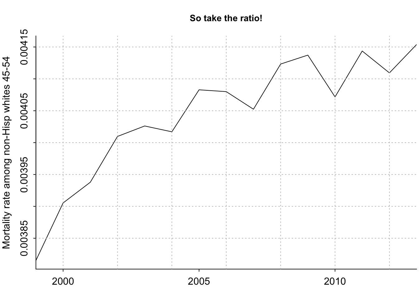
As an aside, I want to better understand how the avg_age vector is calculated:
# flag for when data is from 1999 and for ages 45 to 54
ok <- data[,"Year"]==1999 & data[,"Age"] %in% ages_decade[[2]]

# range of ages 45 to 54
ages_decade[[2]]
[1] 45 46 47 48 49 50 51 52 53 54# 1999 population for ages 45 to 54
data[ok & male,"Population"] + data[ok & !male,"Population"] [1] 3166393 3007083 2986252 2805975 2859406 2868751 2804957 3093631 2148382
[10] 2254975# manually calculated weighted mean
sum(ages_decade[[2]] * (data[ok & male,"Population"] + data[ok & !male,"Population"]) / (sum(data[ok & male,"Population"] + data[ok & !male,"Population"])))[1] 49.25585# weighted.mean output
avg_age[1] # this equals the manually calculated weighted mean. Nice![1] 49.25585length(avg_age) # 15 years: 1999-2013[1] 15head(avg_age)[1] 49.25585 49.29742 49.40278 49.34845 49.34162 49.35910par(mar=c(2.5, 3, 3, .2), mgp=c(2,.5,0), tck=-.01)
plot(years_1, avg_age, xaxt="n", type="l", bty="l", xaxs="i", xlab="", ylab="Avg age among non-Hisp whites 45-54", main="But the average age in this group is going up!", cex.main=.9)
axis(1, seq(1990,2020,5))
grid(col="gray")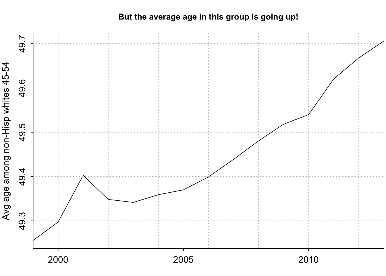
head(death_rate_extrap_2013)[1] 0.003999152 0.004012133 0.004050824 0.004031180 0.004028291 0.004034446par(mar=c(2.5, 3, 3, .2), mgp=c(2,.5,0), tck=-.01)
plot(years_1, number_of_deaths/number_of_people, xaxt="n", type="l", bty="l", xaxs="i", xlab="", ylab="Death rate for 45-54 non-Hisp whites", main="Projecting backward from 2013 makes it clear that\nall the underlying change happened between 1999 and 2005", cex.main=.8)
lines(years_1, death_rate_extrap_2013, col="green4")
axis(1, seq(1990,2020,5))
text(2003, .00395, "Raw death rate", cex=.8)
text(2001.5, .004075, "Expected just from\nage shift", col="green4", cex=.8)
grid(col="gray")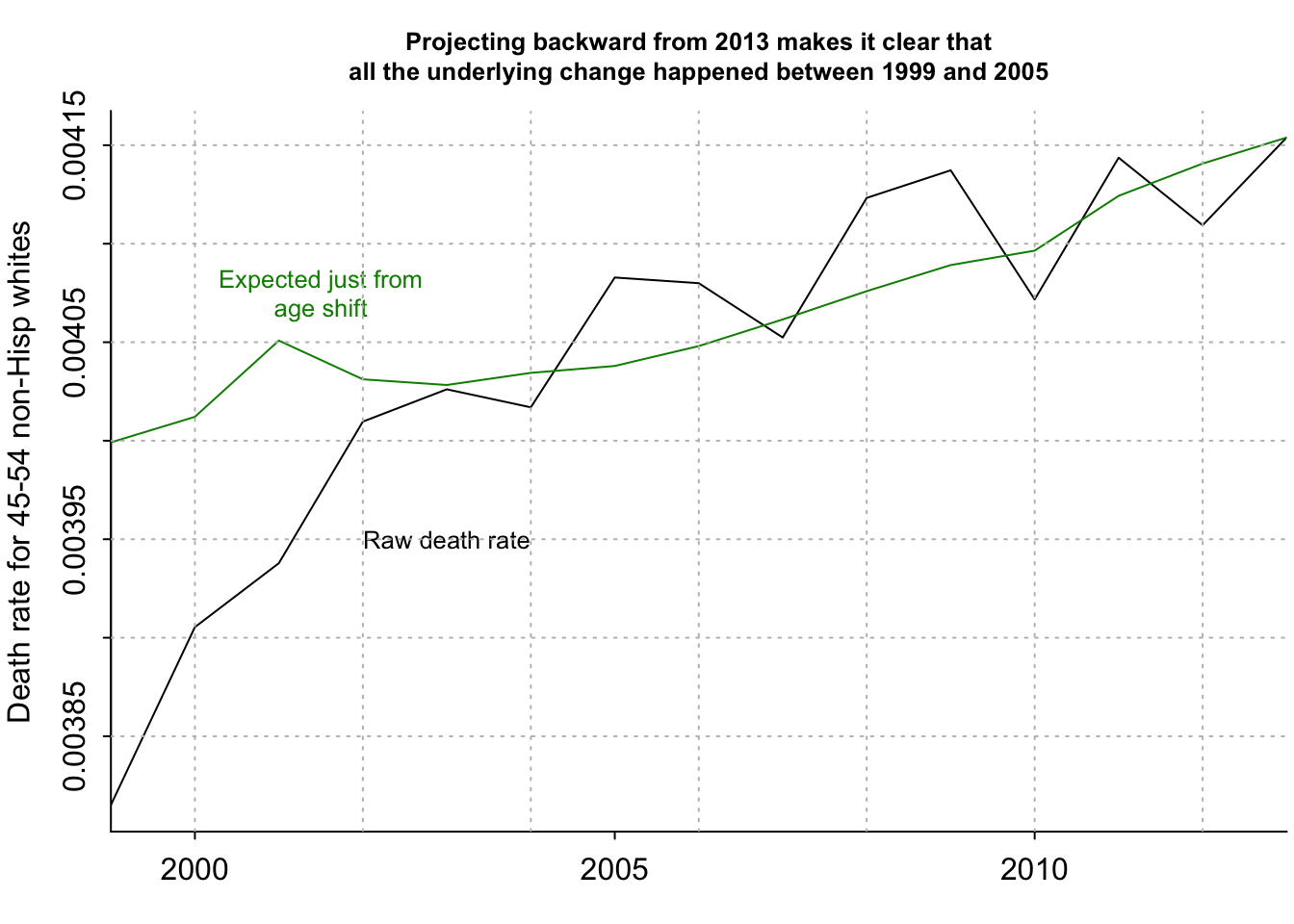
head(age_adj_rate_flat)[1] 0.003908209 0.003978170 0.003964249 0.004053627 0.004072032 0.004058058head(age_adj_rate_flat[1])[1] 0.003908209par(mar=c(2.5, 3, 3, .2), mgp=c(2,.5,0), tck=-.01)
plot(years_1, age_adj_rate_flat/age_adj_rate_flat[1], xaxt="n", type="l", bty="l", xaxs="i", xlab="", ylab="Age-adj death rate, relative to 1999", main="Trend in age-adjusted death rate\nfor 45-54-year-old non-Hisp whites", cex.main=.8)
axis(1, seq(1990,2020,5))
grid(col="gray")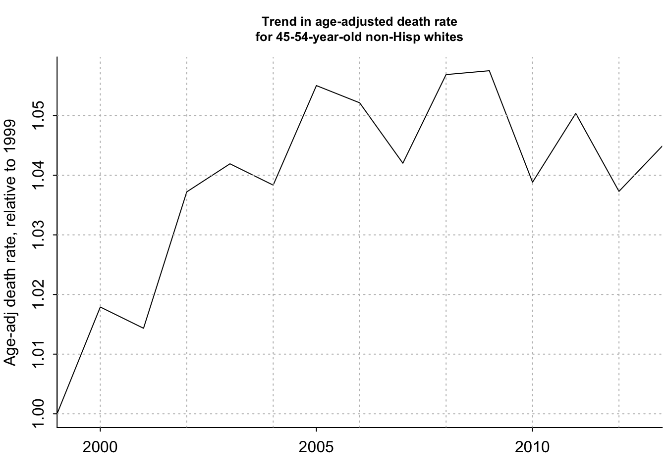
head(age_adj_rate_1999)[1] 0.003815143 0.003889664 0.003891300 0.003976232 0.003999796 0.003987676head(age_adj_rate_1999[1])[1] 0.003815143head(age_adj_rate_2013)[1] 0.003972000 0.004040848 0.004021437 0.004111934 0.004129688 0.004115952head(age_adj_rate_2013[1])[1] 0.003972par(mar=c(2.5, 3, 3, .2), mgp=c(2,.5,0), tck=-.01)
rng <- range(age_adj_rate_flat/age_adj_rate_flat[1], age_adj_rate_1999/age_adj_rate_1999[1], age_adj_rate_2013/age_adj_rate_2013[1])
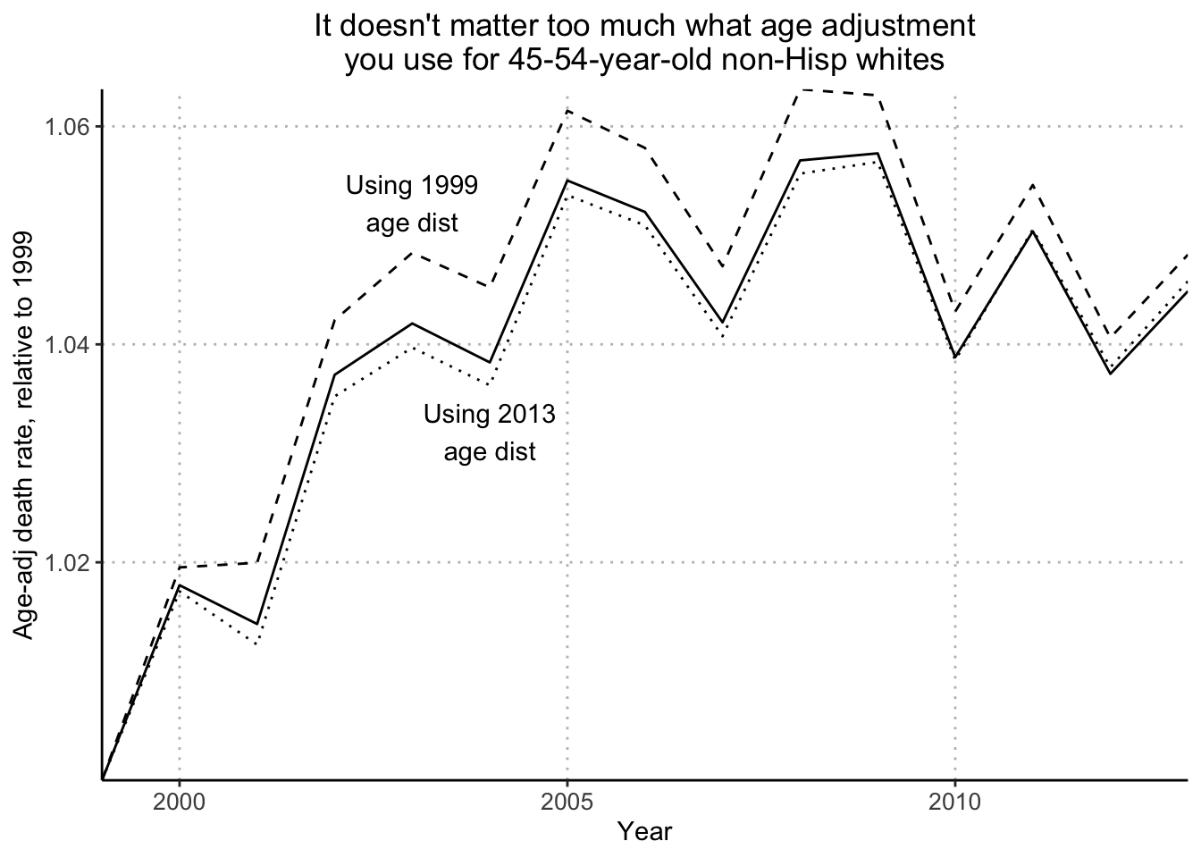
plot(years_1, age_adj_rate_flat/age_adj_rate_flat[1], ylim=rng, xaxt="n", type="l", bty="l", xaxs="i", xlab="", ylab="Age-adj death rate, relative to 1999", main="It doesn't matter too much what age adjustment\nyou use for 45-54-year-old non-Hisp whites", cex.main=.8)
lines(years_1, age_adj_rate_1999/age_adj_rate_1999[1], lty=2)
lines(years_1, age_adj_rate_2013/age_adj_rate_2013[1], lty=3)
text(2003, 1.053, "Using 1999\nage dist", cex=.8)
text(2004, 1.032, "Using 2013\nage dist", cex=.8)
axis(1, seq(1990,2020,5))
grid(col="gray")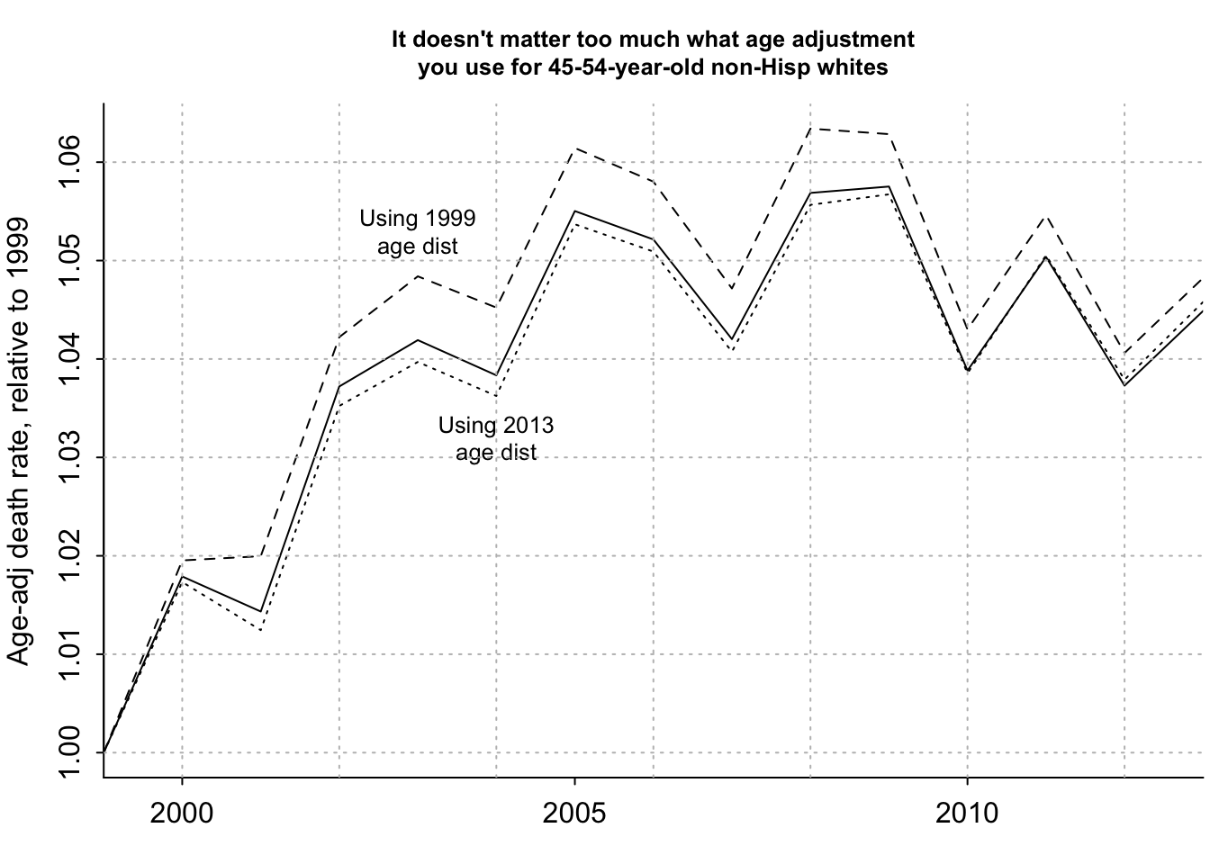
Next, I’ll recreate the plots in Figures 2.11 and 2.12 using tidyverse and ggplot. I’ll go in the order of plots displayed in the supplemental website. They start with Figure 2.11a (Observed increase in raw mortality rates among 45-to-54-year-old non-Hispanic whites, unadjusted for age.
# load death rate data for white non-hispanic individuals
mort_data_fpath <- file.path(data_root_path, "AgePeriodCohort/data","white_nonhisp_death_rates_from_1999_to_2013_by_sex.txt")
mort_data2 <- readr::read_table(mort_data_fpath) %>% filter(
# get data for the age decade in question
Age %in% 45:54
)
── Column specification ────────────────────────────────────────────────────────
cols(
Age = col_double(),
Male = col_double(),
Year = col_double(),
Deaths = col_double(),
Population = col_double(),
Rate = col_double()
)DT::datatable(mort_data2)I’ll look at their vector raw_death_rate to compare my recreated data.frame with.
raw_death_rate[,2,1] [1] 381.5143 390.5378 393.7844 400.9698 402.6102 401.6959 408.2857 407.9969
[9] 405.2389 412.3255 413.7259 407.1706 414.3665 410.9378 415.3878I’ll calculate the raw death rate for each Year. In their code, they multiple it by 100,000 to get per 100,000 deaths, but I’ll follow the textbook plot which shows it as a decimal.
raw_death_rate_data <- mort_data2 %>% group_by(
Year
) %>% summarize(
death_rate = sum(Deaths) / sum(Population)
)
DT::datatable(raw_death_rate_data)Next, I’ll plot the data
ggplot(raw_death_rate_data, aes(x = Year, y = death_rate)) +
geom_line() +
scale_y_continuous("Death rates among non-Hisp whites 45-54", expand = c(0,0)) +
scale_x_continuous("Year", breaks = c(2000, 2005, 2010), expand = c(0,0)) +
theme(
panel.background = element_rect(fill = "white"),
axis.line.x = element_line(color = "black"),
axis.line.y = element_line(color = "black"),
panel.grid.major = element_line(color = "grey", linetype = "dotted", size = 0.5),
plot.title = element_text(hjust = 0.5),
axis.text = element_text(size = 10)
) +
ggtitle("Raw death rates\nfor 45-54-year-old non-Hispanic whites")Warning: The `size` argument of `element_line()` is deprecated as of ggplot2 3.4.0.
ℹ Please use the `linewidth` argument instead.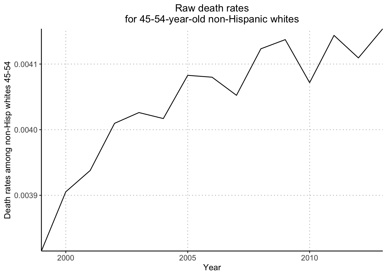
Next, I’ll recreate the data and plots for Figure 2.12c (trends in age-adjusted death rates broken down by sex). I’ll start by calculating the average death rate for Males and Females:
avg_death_rate <- mort_data2 %>% group_by(
Year,
Male
) %>% summarise(
avg_rate = mean(Rate)
) %>% mutate(
age_adj_death_rate = case_when(
Male == 0 ~ avg_rate / 288.19,
Male == 1 ~ avg_rate / 495.37
),
# convert Male to discrete value
Male = case_when(
Male == 0 ~ "Women",
Male == 1 ~ "Men"
)
)`summarise()` has grouped output by 'Year'. You can override using the
`.groups` argument.DT::datatable(avg_death_rate)Next, I’ll plot the age-adjusted death rates (relative to 1999) for Non-Hispanic White Males and Females aged 45 - 54 between 1999 and 2013:
ggplot(avg_death_rate, aes(x = Year, y = age_adj_death_rate, color = Male)) +
geom_line(aes(group = Male), show.legend = FALSE) +
scale_color_manual(values = c("blue", "red")) +
annotate("text", x = 2011.5, y = 1.075, label = "Women", color = "red") +
annotate("text", x = 2010.5, y = 1.02, label= "Men", color = "blue") +
scale_y_continuous("Death rate relative to 1999") +
scale_x_continuous("Year") +
theme(
panel.background = element_rect(fill = "white"),
axis.line.x = element_line(color = "black"),
axis.line.y = element_line(color = "black"),
panel.grid.major = element_line(color = "grey", linetype = "dotted", size = 0.5),
plot.title = element_text(hjust = 0.5),
axis.text = element_text(size = 10)
) +
ggtitle("Age-adjusted death rates for non-Hispanic whites aged 45-54:\nTrends for women and men")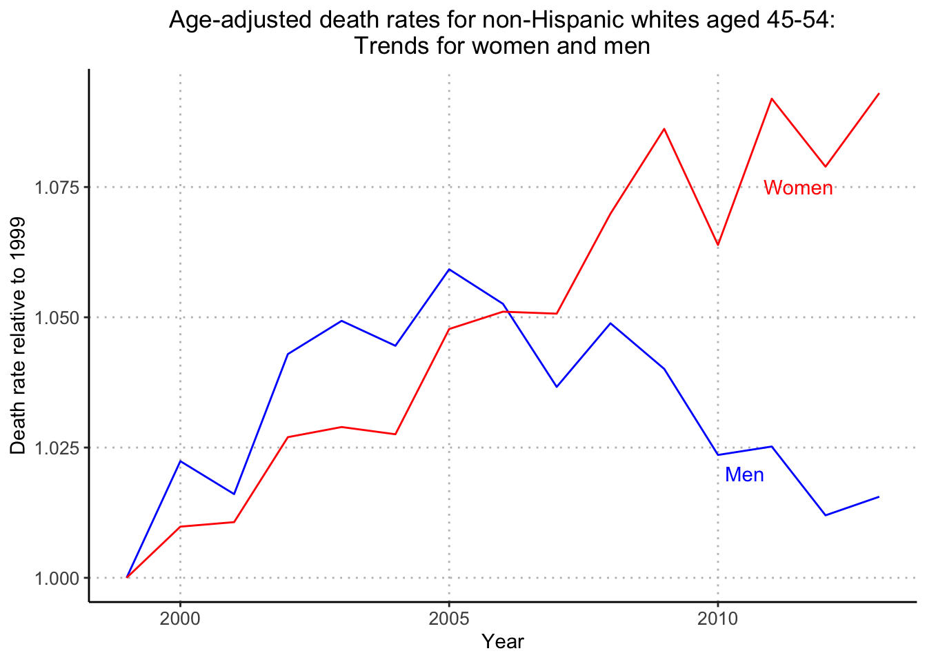
Looks great! My grid lines are at different placements (5 years and 0.025 death rate) than the textbook but I’m happy with how the plot turned out. One hiccup that needed to be addressed was that the group aesthetic needs to be discrete (it was integer 1 for Male and integer 0 for Female) in order to use scale_color_manual.
Next, I’ll recreate Figure 2.11b (increase in average age of this group as the baby boom generation moves through).
avg_age_data <- mort_data2 %>% group_by(
Year,
Age
) %>% summarise(
total_pop = sum(Population)
) %>% mutate(
# calculated weighted mean
weighted_age = Age * total_pop
) %>% group_by(
# in order to calculate weighted mean age by Year,
# group only by Year
Year
) %>% summarize(
weighted_mean_age = sum(weighted_age) / sum(total_pop)
)`summarise()` has grouped output by 'Year'. You can override using the
`.groups` argument.DT::datatable(avg_age_data)Let’s compare it with the actual avg_age values:
avg_age [1] 49.25585 49.29742 49.40278 49.34845 49.34162 49.35910 49.36995 49.39921
[9] 49.43863 49.48060 49.51819 49.53985 49.62024 49.66772 49.70577Next, I’ll plot weighted mean age vs years:
ggplot(avg_age_data, aes(x = Year, y = weighted_mean_age)) +
geom_line() +
scale_y_continuous("Avg age among non-Hispanic whites 45-54", expand = c(0,0)) +
scale_x_continuous("Year", expand = c(0,0)) +
theme(
panel.background = element_rect(fill = "white"),
axis.line.x = element_line(color = "black"),
axis.line.y = element_line(color = "black"),
panel.grid.major = element_line(color = "grey", linetype = "dotted", size = 0.5),
plot.title = element_text(hjust = 0.5),
axis.text = element_text(size = 10)
) +
ggtitle("But the average age in this group is going up!")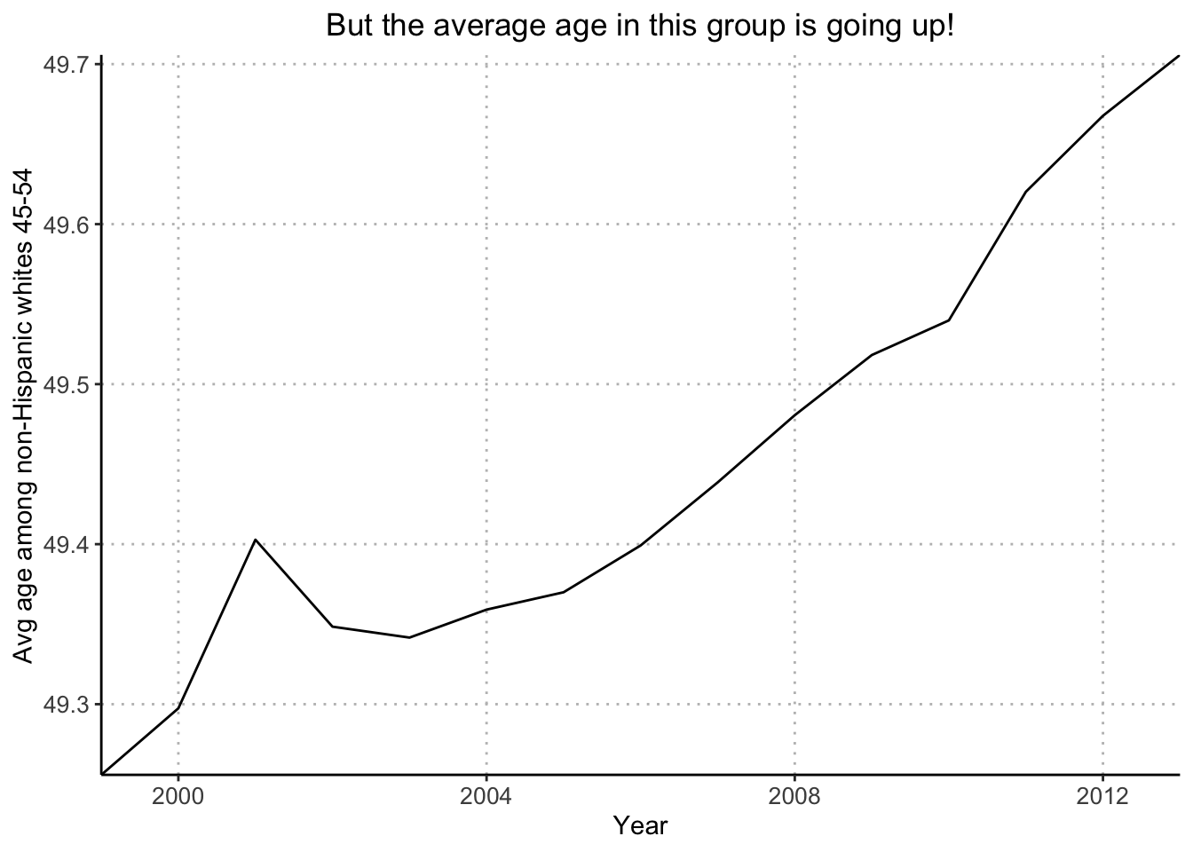
Next, I’ll recreate Figure 2.11c (raw death rate, along with trend in death rate attributable by change in age distribution alone, had age-specific mortality rates been at the 2013 level throughout).
As an aside, I’m going to manually calculate the first value of death_rate_extrap_2013:
# death rates in 2013 for ages 45:54
death_rate_2013 [1] 0.002607366 0.002898205 0.003235408 0.003428914 0.003845450 0.004221539
[7] 0.004660622 0.004944160 0.005267291 0.005727139# weighted mean of 2013 death rates of ages 45:54 by 1999-2013 population of ages 45-54
death_rate_extrap_2013 [1] 0.003999152 0.004012133 0.004050824 0.004031180 0.004028291 0.004034446
[7] 0.004037951 0.004048038 0.004061568 0.004075922 0.004089161 0.004096481
[13] 0.004124305 0.004140684 0.004153878# flag for when data is from 1999 and for ages 45 to 54
ok <- data[,"Year"]==1999 & data[,"Age"] %in% ages_decade[[2]]
# 1999 population for ages 45 to 54
data[ok & male,"Population"] + data[ok & !male,"Population"]
[1] 3166393 3007083 2986252 2805975 2859406 2868751 2804957 3093631 2148382
[10] 2254975# numerator of weighted mean
death_rate_2013 * (data[ok & male,"Population"] + data[ok & !male,"Population"]) [1] 8255.944 8715.142 9661.744 9621.447 10995.704 12110.545 13072.845
[8] 15295.406 11316.152 12914.555# weighted mean of death_rate_2013 and 1999 population
sum(death_rate_2013 * (data[ok & male,"Population"] + data[ok & !male,"Population"]) / (sum(data[ok & male,"Population"] + data[ok & !male,"Population"])))[1] 0.003999152I’ll first calculate the total deaths, population and death rate for each year and age value.
mort_data_totals <- mort_data2 %>% group_by(
  # calculate total death rate and total population
  # for each year and age
  Year,
  Age
) %>% summarise(
  total_deaths = sum(Deaths),
  total_pop = sum(Population),
  total_death_rate = total_deaths / total_pop
)
`summarise()` has grouped output by 'Year'. You can override using the
`.groups` argument.DT::datatable(mort_data_totals %>% filter(Year == 2013)) # matches death_rate_2013Next, I’ll widen the data:
death_rate_extrap_2013_data <- mort_data_totals %>% pivot_wider(
  names_from = Year,
  values_from = c(total_death_rate, total_pop),
  names_vary = "slowest",
  id_cols = c(Age)
) %>% mutate(
  # multiply each year's age population with 2013 death rate
  across(starts_with("total_pop"), ~ .x * total_death_rate_2013, .names = "extrap_{.col}")
) %>% pivot_longer(
  # return back to a long table
  # in order to group by Age, Year and calculate weighted mean
  !Age,
  names_to = c(".value", "Year"),
  names_pattern = "^(.*)_([0-9]{4})$"
) %>% group_by(
  Year
) %>% summarise(
  weighted_mean_extrap = sum(extrap_total_pop) / sum(total_pop)
)

DT::datatable(death_rate_extrap_2013_data, options = list(scrollX = TRUE))
My calculated values match death_rate_extrap_2013. Yes!
Next, I’ll prepare the data to recreate number_of_deaths/number_of_people in the text:
yearly_total_death_rate <- mort_data2 %>% group_by(
  # calculate total death rate and total population
  # for each year
  Year
) %>% summarise(
  total_death_rate = sum(Deaths) / sum(Population)
) %>% mutate(
  Year = as.character(Year)
)

DT::datatable(yearly_total_death_rate)
Next, I’ll plot the extrapolated death rate vs. years:
ggplot() +
  geom_line(data = death_rate_extrap_2013_data, aes(x = Year, y = weighted_mean_extrap, group = 1), color = "green4") +
  geom_line(data = yearly_total_death_rate, aes(x = Year, y = total_death_rate, group = 1), color = "black") +
  scale_y_continuous("Death rate for 45-54 non-Hisp whites", expand = c(0,0)) +
  scale_x_discrete("Year", breaks = c(2000, 2005, 2010), expand = c(0,0)) +
  theme(
    panel.background = element_rect(fill = "white"),
    axis.line.x = element_line(color = "black"),
    axis.line.y = element_line(color = "black"),
    panel.grid.major = element_line(color = "grey", linetype = "dotted", size = 0.5),
    plot.title = element_text(hjust = 0.5),
    axis.text = element_text(size = 10)
  ) +
  ggtitle("Projecting backward from 2013 makes it clear that\nall the underlying change happened between 1999 and 2005") +
  annotate("text", x = "2003", y = 0.00395, label = "Raw death rate") +
  annotate("text", x = "2002", y = 0.004075, label = "Expected just from\nage shift", color="green4")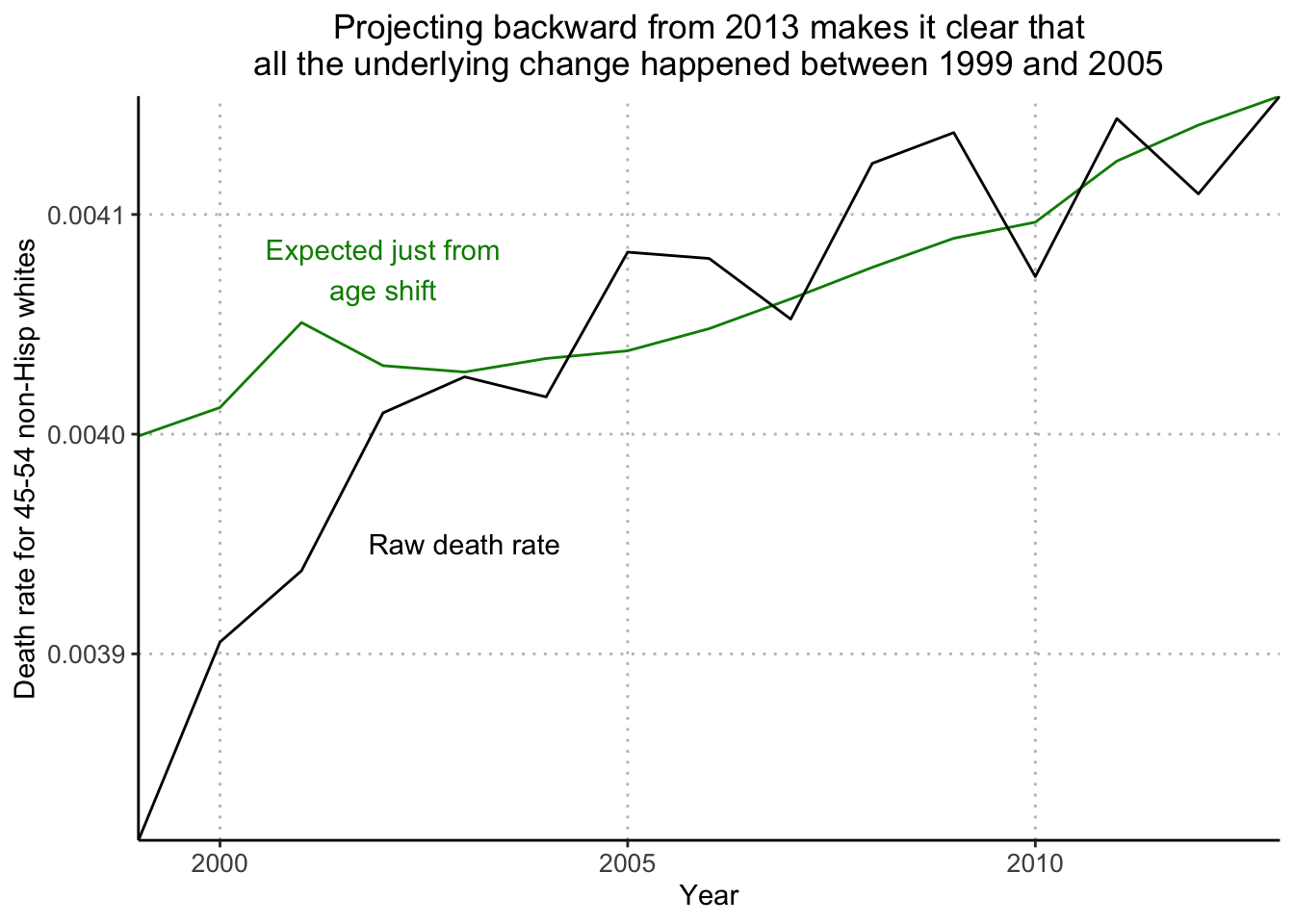
The next plot I’ll recreate is Figure 2.12a (Age-adjusted death rates among 45-to-54-year-old non-Hispanic whites, showing an increase from 1999 to 2005 and a steady pattern since 2005).
I’ll start by looking at the vector age_adj_rate_flat:
age_adj_rate_flat [1] 0.003908209 0.003978170 0.003964249 0.004053627 0.004072032 0.004058058
[7] 0.004123289 0.004112009 0.004072423 0.004130493 0.004133025 0.004059948
[13] 0.004105064 0.004053953 0.004083609Then run the calculation for the first value for 1999:
# flag for data in 1999 for ages 45 to 54
ok <- data[,"Year"]==1999 & data[,"Age"] %in% ages_decade[[2]]

# calculation of death rates
rates <- (data[ok&male,"Deaths"] + data[ok&!male,"Deaths"])/(data[ok&male,"Population"] + data[ok&!male,"Population"])

print(rates)
[1] 0.002622542 0.002929417 0.003059018 0.003371734 0.003589906 0.003767493
[7] 0.004289549 0.004447848 0.005451079 0.005553498# non-weighted mean
mean(rates)[1] 0.003908209# calculation of age_adj_rate_flat
weighted.mean(rates, rep(1,10))[1] 0.003908209The calculation for this metric is similar to Figure 2.12c which showed the age-adjusted death rate by sex. Instead of separating by sex, I’ll combine Men and Women deaths and populations in this death rate calculation.
age_adj_rate_flat_data <- mort_data2 %>% group_by(
  Year,
  Age
) %>% summarise(
  # calculate death rate for each Year and Age
  avg_rate = sum(Deaths) / sum(Population)
) %>% group_by(
  Year
) %>% summarise(
  # calculate average death rate across ages 45-54 for each Year
  avg_rate = mean(avg_rate)
) %>% mutate(
  # adjust death rate relative to 1999
  adj_death_rate = avg_rate / 0.00390820851324269
)
`summarise()` has grouped output by 'Year'. You can override using the
`.groups` argument.DT::datatable(age_adj_rate_flat_data)Next, I’ll plot age-adjusted death rate relative to 1999 vs. Years:
ggplot(age_adj_rate_flat_data, aes(x = Year, y = adj_death_rate)) +
  geom_line() +
  scale_y_continuous("Age-adj death rate, relative to 1999", expand = c(0,0)) +
  scale_x_continuous("Year", breaks = c(2000, 2005, 2010), expand = c(0,0)) +
  theme(
    panel.background = element_rect(fill = "white"),
    axis.line.x = element_line(color = "black"),
    axis.line.y = element_line(color = "black"),
    panel.grid.major = element_line(color = "grey", linetype = "dotted", size = 0.5),
    plot.title = element_text(hjust = 0.5),
    axis.text = element_text(size = 10)
  ) +
  ggtitle("Trend in age-adjusted death rate\nfor 45-54-year-old non-Hisp whites")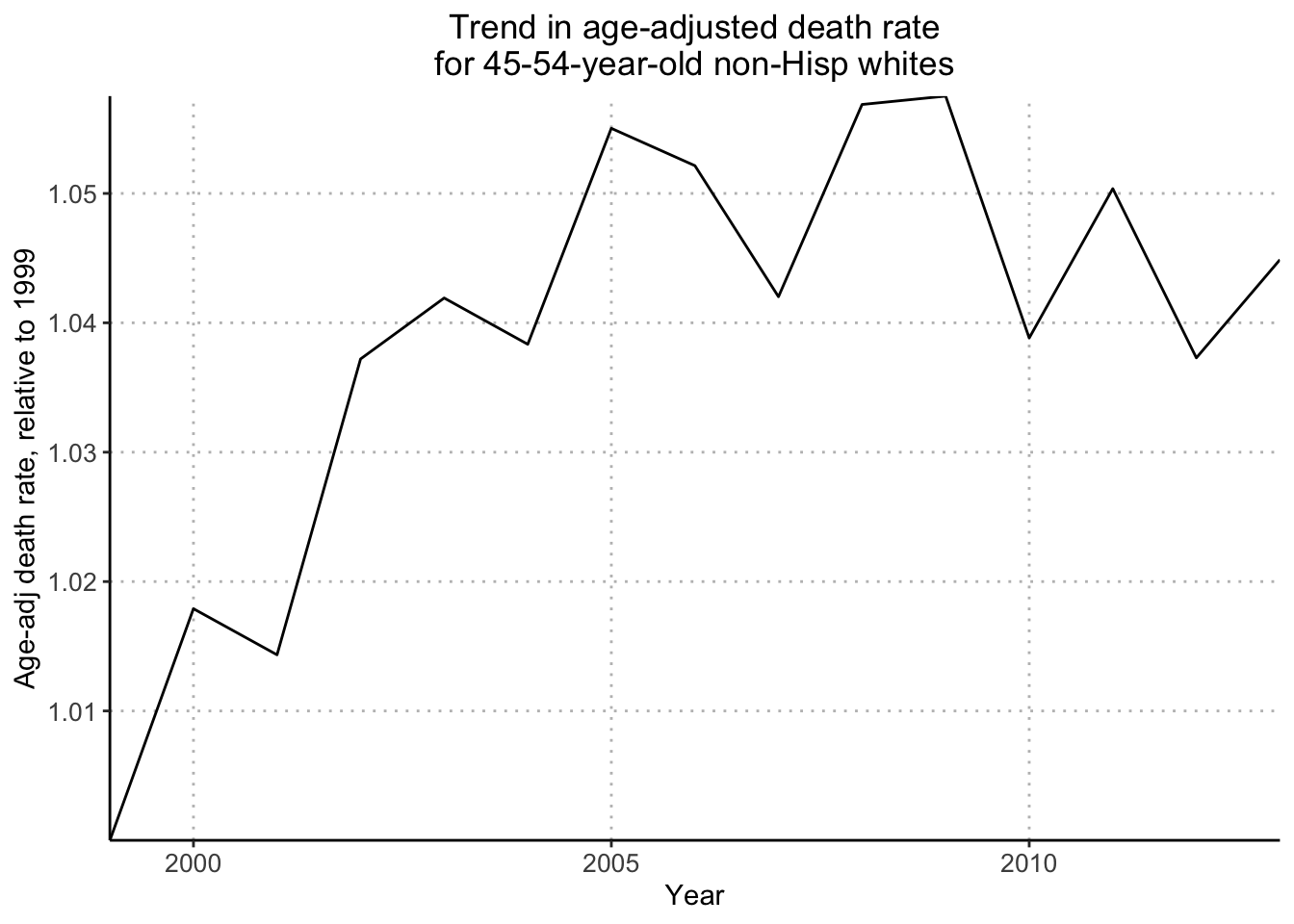
The final figure I’ll recreate is Figure 2.12b (comparison of two different age adjustments).
I’ll start by looking at the vectors in question, age_adj_rate_1999 and age_adj_rate_2013.
age_adj_rate_1999 [1] 0.003815143 0.003889664 0.003891300 0.003976232 0.003999796 0.003987676
[7] 0.004049536 0.004036497 0.003995087 0.004057049 0.004054927 0.003979230
[13] 0.004023539 0.003970082 0.003999152age_adj_rate_2013 [1] 0.003972000 0.004040848 0.004021437 0.004111934 0.004129688 0.004115952
[7] 0.004185252 0.004174235 0.004133826 0.004193094 0.004197334 0.004125137
[13] 0.004172716 0.004122541 0.004153878As an aside, I’ll view the first values (1999 and 2013) from each of the two vectors respectively, following the their code.
# flag for 1999 and 45-54 age range
ok <- data[,"Year"]==1999 & data[,"Age"] %in% ages_decade[[2]]

# average death rates
rates <- (data[ok&male,"Deaths"] + data[ok&!male,"Deaths"])/(data[ok&male,"Population"] + data[ok&!male,"Population"])

# 1999 average death rates
print(rates)
[1] 0.002622542 0.002929417 0.003059018 0.003371734 0.003589906 0.003767493
[7] 0.004289549 0.004447848 0.005451079 0.005553498# 1999 population
print(pop1999) [1] 3166393 3007083 2986252 2805975 2859406 2868751 2804957 3093631 2148382
[10] 2254975# first value of age_adj_rate_1999
weighted.mean(rates, pop1999)[1] 0.003815143# flag for 1999 and 45-54 age range
ok <- data[,"Year"]==2013 & data[,"Age"] %in% ages_decade[[2]]
# average death rates
rates <- (data[ok&male,"Deaths"] + data[ok&!male,"Deaths"])/(data[ok&male,"Population"] + data[ok&!male,"Population"])
# 2013 average death rates
print(rates) [1] 0.002607366 0.002898205 0.003235408 0.003428914 0.003845450 0.004221539
[7] 0.004660622 0.004944160 0.005267291 0.005727139# 2013 population
print(pop2013) [1] 2576547 2629559 2692087 2905293 3017592 3054810 3099157 3182745 3199178
[10] 3141010# first value of age_adj_rate_2013
weighted.mean(rates, pop2013)[1] 0.004153878I’ll start by reusing my data.frame mort_data_totals which contains Year, Age, total_deaths, total_pop and total_death_rate.
DT::datatable(mort_data_totals)I’ll use a similar approach to how I created death_rate_extrap_2013_data.
pop_1999_adj_death_rate <- mort_data_totals %>% pivot_wider(
  names_from = Year,
  values_from = c(total_death_rate, total_pop),
  names_vary = "slowest",
  id_cols = c(Age)
) %>% mutate(
  # calculate weighted mean for death rates with 1999 population
  across(starts_with("total_death_rate"), ~ sum(.x * total_pop_1999) / sum(total_pop_1999), .names = "adj_{.col}")
) %>% pivot_longer(
  # return back to a long table
  !Age,
  names_to = c(".value", "Year"),
  names_pattern = "^(.*)_([0-9]{4})$"
) %>% group_by(
  Year
) %>% dplyr::select(
  # pull columns needed for plot
  Year,
  adj_total_death_rate
) %>% distinct(
  Year, adj_total_death_rate
) %>% mutate(
  # normalize death rate relative to 1999 value
  adj_total_death_rate = adj_total_death_rate / 0.0038151430187487,
  # make Year continuous
  Year = as.numeric(Year)
)

DT::datatable(pop_1999_adj_death_rate, options = list(scrollX = TRUE))
I’ll create the same data.frame for the 2013 adjusted death rates:
pop_2013_adj_death_rate <- mort_data_totals %>% pivot_wider(
  names_from = Year,
  values_from = c(total_death_rate, total_pop),
  names_vary = "slowest",
  id_cols = c(Age)
) %>% mutate(
  # calculate weighted mean for death rates with 1999 population
  across(starts_with("total_death_rate"), ~ sum(.x * total_pop_2013) / sum(total_pop_2013), .names = "adj_{.col}")
) %>% pivot_longer(
  # return back to a long table
  !Age,
  names_to = c(".value", "Year"),
  names_pattern = "^(.*)_([0-9]{4})$"
) %>% group_by(
  Year
) %>% dplyr::select(
  # pull columns needed for plot
  Year,
  adj_total_death_rate
) %>% distinct(
  Year, adj_total_death_rate
) %>% mutate(
  # normalize death rate relative to 1999 value
  adj_total_death_rate = adj_total_death_rate / 0.00397199977461337,
  # make Year continuous
  Year = as.numeric(Year)
)

DT::datatable(pop_2013_adj_death_rate, options = list(scrollX = TRUE))
Finally, I’ll plot the three lines:
ggplot() +
  geom_line(data = age_adj_rate_flat_data, aes(x = Year, y = adj_death_rate)) +
  geom_line(data = pop_1999_adj_death_rate, aes(x = Year, y = adj_total_death_rate), linetype = "dashed") +
  geom_line(data = pop_2013_adj_death_rate, aes(x = Year, y = adj_total_death_rate), linetype = "dotted") +
  scale_y_continuous("Age-adj death rate, relative to 1999", expand = c(0,0)) +
  scale_x_continuous("Year", breaks = c(2000, 2005, 2010), expand = c(0,0)) +
  theme(
    panel.background = element_rect(fill = "white"),
    axis.line.x = element_line(color = "black"),
    axis.line.y = element_line(color = "black"),
    panel.grid.major = element_line(color = "grey", linetype = "dotted", size = 0.5),
    plot.title = element_text(hjust = 0.5),
    axis.text = element_text(size = 10)
  ) +
  ggtitle("It doesn't matter too much what age adjustment\nyou use for 45-54-year-old non-Hisp whites") +
  annotate("text", x = 2003, y = 1.053, label = "Using 1999\nage dist") +
  annotate("text", x = 2004, y = 1.032, label = "Using 2013\nage dist")